
Welcome to our weekly newsletter on the S&P 500.
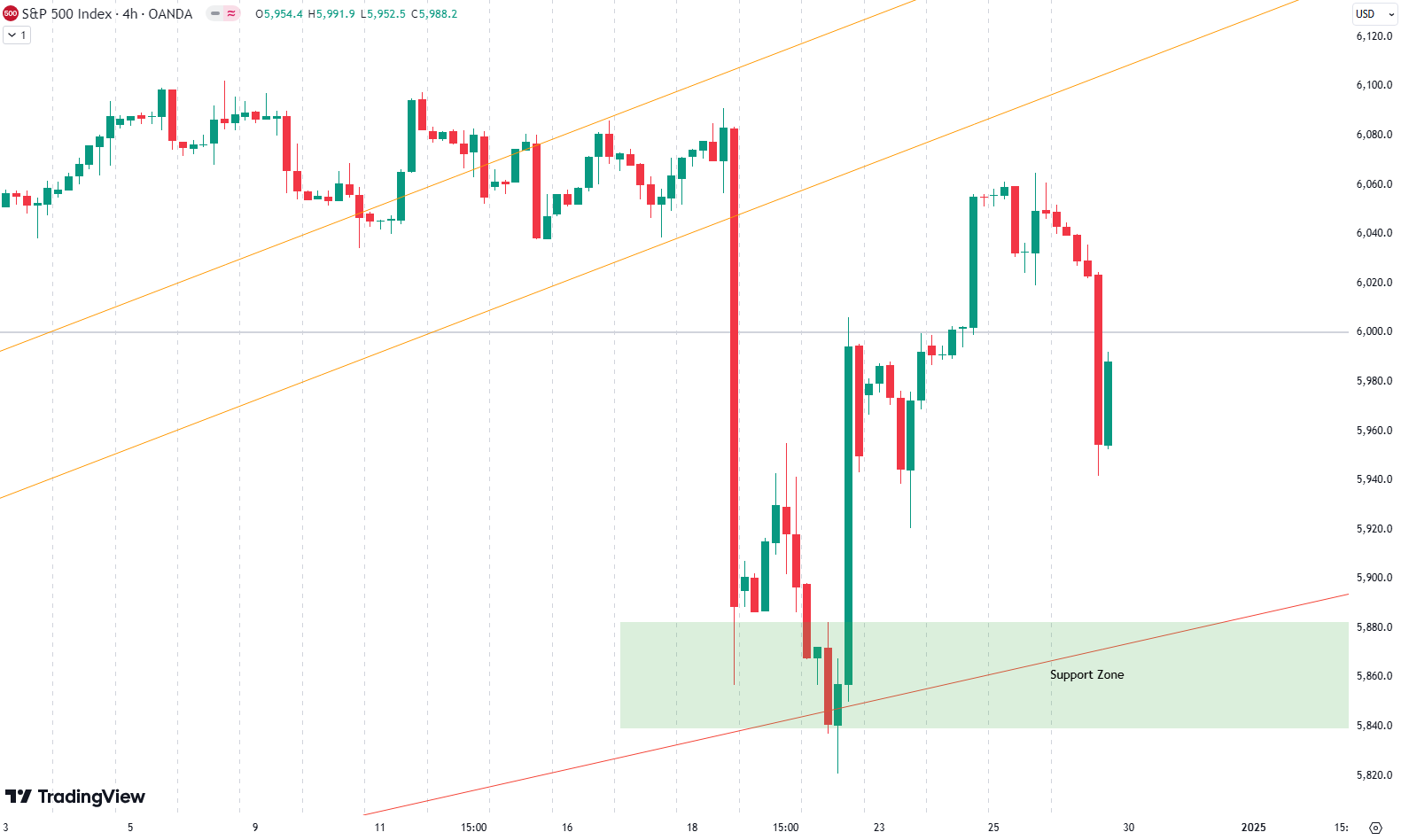
This week, the S&P 500 experienced a gain of 0.6%. When observing the four-hour chart, the last two weeks displayed notable volatility. Last week saw a sharp drop, whereas this week was less erratic, though the market still moved up and down. The result was a steady climb with a minor correction on Monday, followed by gains during the midweek and a drop on Friday.
The key area to watch remains the 6000-point level, marked on the chart as the grey “line in the sand.” This level plays a crucial role as the market hovers slightly below it. Breaking above and maintaining support here could open the door to further upside. On the flip side, if prices fail to hold, the market may face another downside leg. In the coming sessions, prices will likely retest this level, making it essential to monitor how the market reacts.
Our last position, which we placed on November 20, has been active until December 10, when we sold it for a gain of 5.7%
Are you wondering when to buy the S&P 500 as an investor? Explore our tailored services and join our growing community of do-it-yourself investors who have successfully navigated the market with our guidance.
Premium Guide
Advanced Investing Signals
Basic Guide
Basic Investing
Signals
Simple Guide
Selected
Signals
Congratulations! You’ve discovered your new free financial guide. Simply sign up for our most popular service, our Simple Guide.
Market channel reveals insights
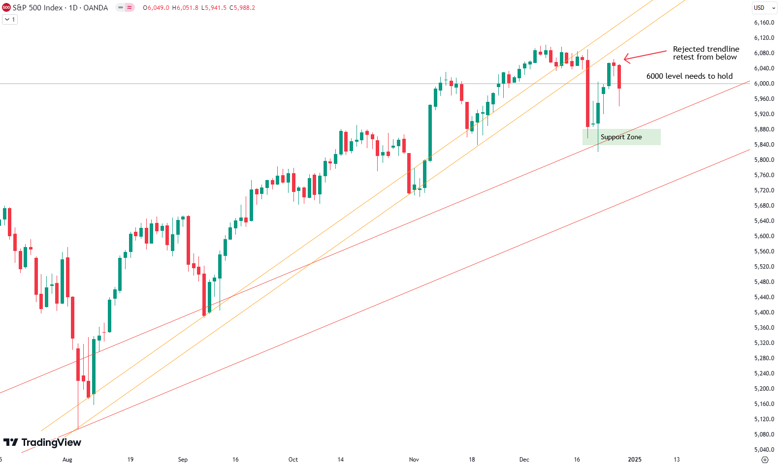
On the daily chart, the grey 6000-point line is once again visible, joined by the orange trendline that was broken two weeks ago. Following that break, the S&P 500 experienced a sharp drop into the green support zone—an area highlighted in previous updates—which successfully provided support for prices. Additionally, the red rising trendline from the weekly chart, previously a reliable support, was tested again before the market began its sharp rebound.
The 6000-point level remains the critical “line in the sand.” As prices hover around this mark, the market could move in either direction depending on whether this level acts as support or resistance.
To add perspective, the logarithmic weekly chart offers a broad view of market activity since October 2022. Here, a consistent upward trend channel is visible, with parallel green (support), grey (midpoint), and red (resistance) lines defining the channel’s bounds. Prices have often found support or resistance along these lines. Recently, the market has been near the red line, indicating a potentially overbought scenario.
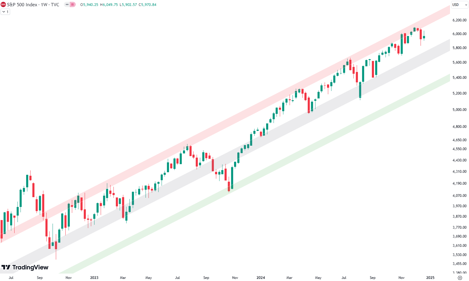
With the recent drop over the past two weeks, prices are edging closer to the grey midline, a significant support zone in the trend channel. Testing this level could stabilize the market and present new opportunities for movement. This scenario will be closely watched over the coming sessions.
For subscribers it is very important to follow our risk management measures that we provide with all our services to protect against losses in case support zones break
S&P 500: An Unusual Year for Seasonality
Historically, the S&P 500 tends to follow seasonal patterns. Typically, markets weaken leading up to the November election, followed by a rally into the end of the year. This year, however, deviated from the norm. There was no significant correction before the election.
Instead, the S&P 500 has shown exceptional strength throughout the year, with gains far outpacing those of previous years. While the seasonal pattern chart suggests a strong rally to close the year, the deviation earlier in the year indicates that the market may not follow this trajectory. This unpredictability highlights the need for caution when looking at historical trends.
However, it’s important to interpret this seasonality with caution, especially this year, as we have already experienced a significant rise in prices. Investors should consider both seasonality trends and our analysis for a balanced view. Proper risk management is essential in navigating these market conditions.

Our Market Dashboard provides a quick overview of the current market conditions and, more importantly, the associated risk. You can view a chart of one of our tools, the Risk Level Indicator, showing predicted risk from 1998 to 2024. If you are interested, you can visit our Dashboard site here.

The world of finance is complex and includes many technical terms. For explanations of these terms, I recommend using the Investopedia dictionary.
Leave a Reply