
Hello everybody, and welcome to this week’s analysis of the S&P 500. I am writing this during Friday’s trading session, so the week is not yet fully completed. As of now, the S&P 500 is up about 0.5% for the week, although that can still change by the close.
Looking at the 4-hour chart, we can see that last week price declined into the 6,800-point zone. Since then, we have seen mostly sideways movement, with several intraday swings. The 6,900-point area has acted as resistance, and price has been oscillating between 6,800 and 6,900. Overall, there has not been much directional movement so far this week.

Today, the Supreme Court ruled against the tariffs imposed by Trump. This is an important development, but so far it has not had a significant impact on the market, as you can see on the chart.
Are you wondering when to buy the S&P 500 as an investor? Join our community of smart do-it-yourself investors who are making informed decisions with our expert insights, just by signing up with your email!
Premium Guide
Advanced Investing Signals
Basic Guide
Basic Investing
Signals
Simple Guide
Selected
Signals
Get started today with our free financial guide! Just enter your email, and you’ll start receiving our most popular Simple Guide with exclusive market signals right in your inbox.
Short-Term Downward Channel Emerges on the Daily Chart
Now let’s look at the daily chart we published last week. We highlighted the key resistance zone at 7,000 points and the key support zone at 6,800 points. We also pointed out the small gap to the upper red-shaded area of the broader trend channel, where price had previously failed to fully test the upper boundary.
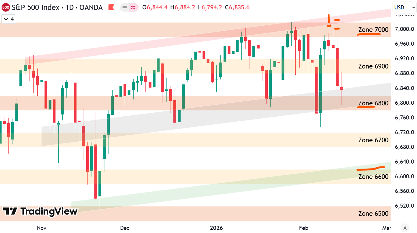
Looking at this week’s price action, the 6,800-point zone has once again acted as important support, confirming its relevance. In addition, we can now draw three black trend lines that form a downward-sloping short-term trend channel. We will need to see whether this structure holds in the coming sessions. So far, price has tested the lower black trend line three times and the upper one twice. If this pattern continues, it could confirm a short-term downward channel.
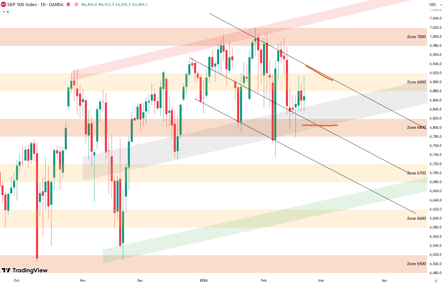
At the same time, the broader upward-sloping trend channel, defined by the green, gray, and red shaded areas, is still intact. For next week, I have marked the key support and resistance levels with red lines. The 6,800-point zone remains the most important support. On the upside, the upper boundary of the short-term downward-sloping black trend channel now acts as resistance.
If further downside occurs, the 6,800 level would need to be decisively broken to open the way for a larger move lower. Until that happens, price remains within a tight consolidation range.
Risk Outlook
Turning to our risk indicators, we first look at the short-term risk model. On the bottom panel, the S&P 500 is shown in black, with the buy score in green and the sell score in red. The top right shows a zoomed-in view, and the top left displays the resulting buy and sell signals.
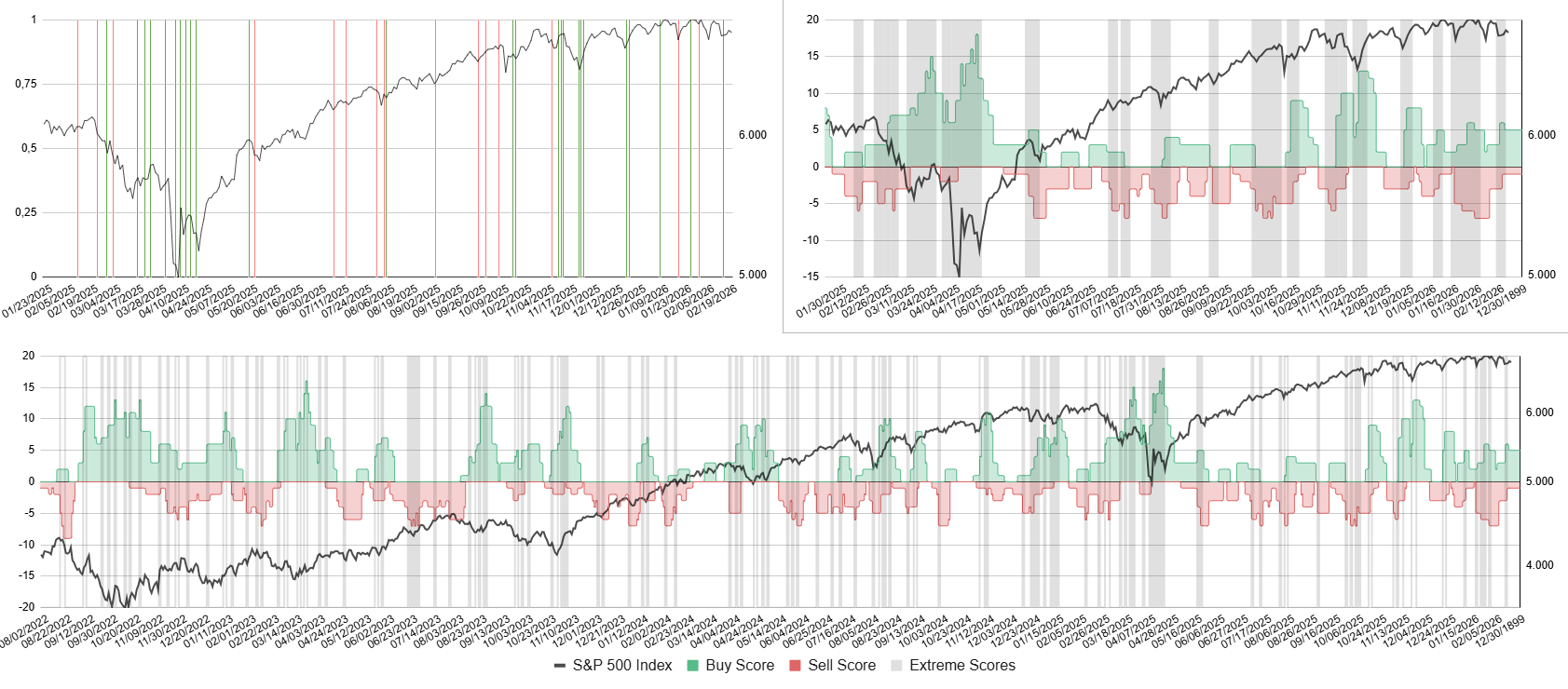
This week, the buy score increased slightly, triggering a buy signal. You can see this as a green vertical line on the top-left chart, marking a potential short-term bottom. We now need to see how this develops next week and whether additional buy or sell signals are generated. If you are interested in receiving these signals, we provide them through our free email newsletter, which you can subscribe to.
Finally, looking at the mid-term risk outlook, the bottom chart shows the S&P 500 since 2017 with shaded areas indicating different risk environments, ranging from very low risk to very high risk. We remain in the grey-shaded area, which indicates a low-risk environment, though not a very low-risk one. There has been no significant change here.
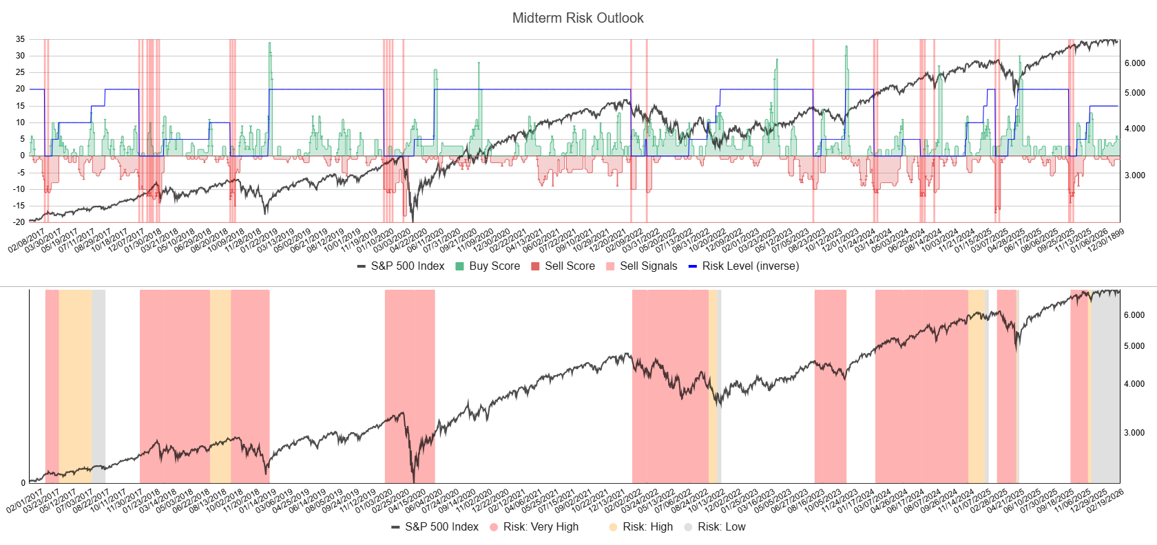
We continue to consolidate in a relatively narrow range of roughly 3% for more than three months now. It is only a matter of time before we see a larger breakout, either to the upside or to the downside. Until then, we will continue to monitor these levels and update the risk outlook each week.
We also have an article (Update: February 19, 2026) on the broader S&P 500 outlook. From a big-picture perspective, the technicals on the weekly chart are less positive and suggest that another correction could be developing in the coming weeks.
For subscribers it is very important to follow our risk management measures that we provide with all our services to protect against losses in case support zones break
Stay ahead of the market! Sign up for our weekly updates and get additional expert insights on the S&P 500, key support levels, and market trends.
S&P 500: Seasonality Insights for 2026
When we look at the seasonality of the S&P 500, the last quarter of 2025 did not line up very well with the typical seasonal pattern. That’s not a problem, though — seasonality should be seen more like a weather model. It gives us a possible direction the market could take, not a precise forecast.
We did see weakness in October, which actually matched the seasonal pattern, as seasonality often points to a softer October. However, we did not get the strong year-end rally that seasonality would normally suggest.
Looking ahead to the first quarter of 2026, the seasonal pattern points to potential weakness in January, followed by rising prices in February, with a possible peak during that month. After that, seasonality suggests renewed weakness into March to start the year. We’ll have to see whether the market follows this pattern.

Seasonality isn’t a perfect roadmap — it rarely plays out exactly the same way each year. But it does offer useful context. Right now, it suggests that while the broader trend remains positive into year-end, a short-term correction could still unfold before the next strong push higher into December.
Of course, this isn’t a guarantee — it’s more of a roadmap based on past patterns. Ultimately, seasonal trends provide valuable context, but they must be considered alongside current market dynamics and technical analysis for a clearer picture.
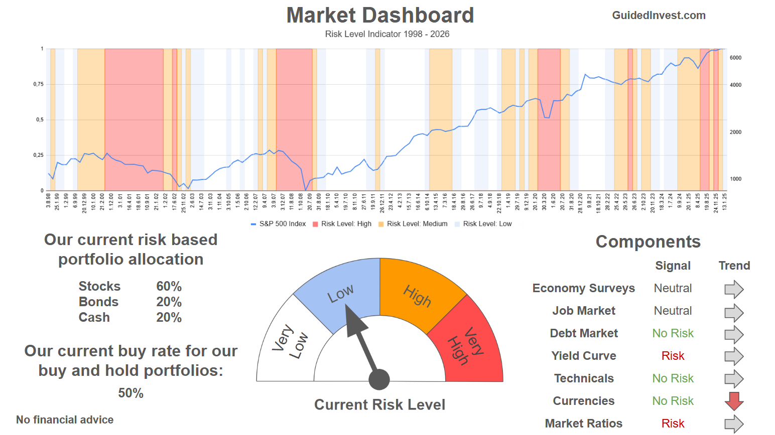
Track Market Risk with Our Dashboard
Our Market Dashboard provides a quick overview of the current market conditions and, more importantly, the associated risk. You can view a chart of one of our tools, the Risk Level Indicator, showing predicted risk from 1998 to 2025. If you are interested, you can visit our Dashboard site here.
The world of finance is complex and includes many technical terms. For explanations of these terms, I recommend using the Investopedia dictionary.
Leave a Reply