
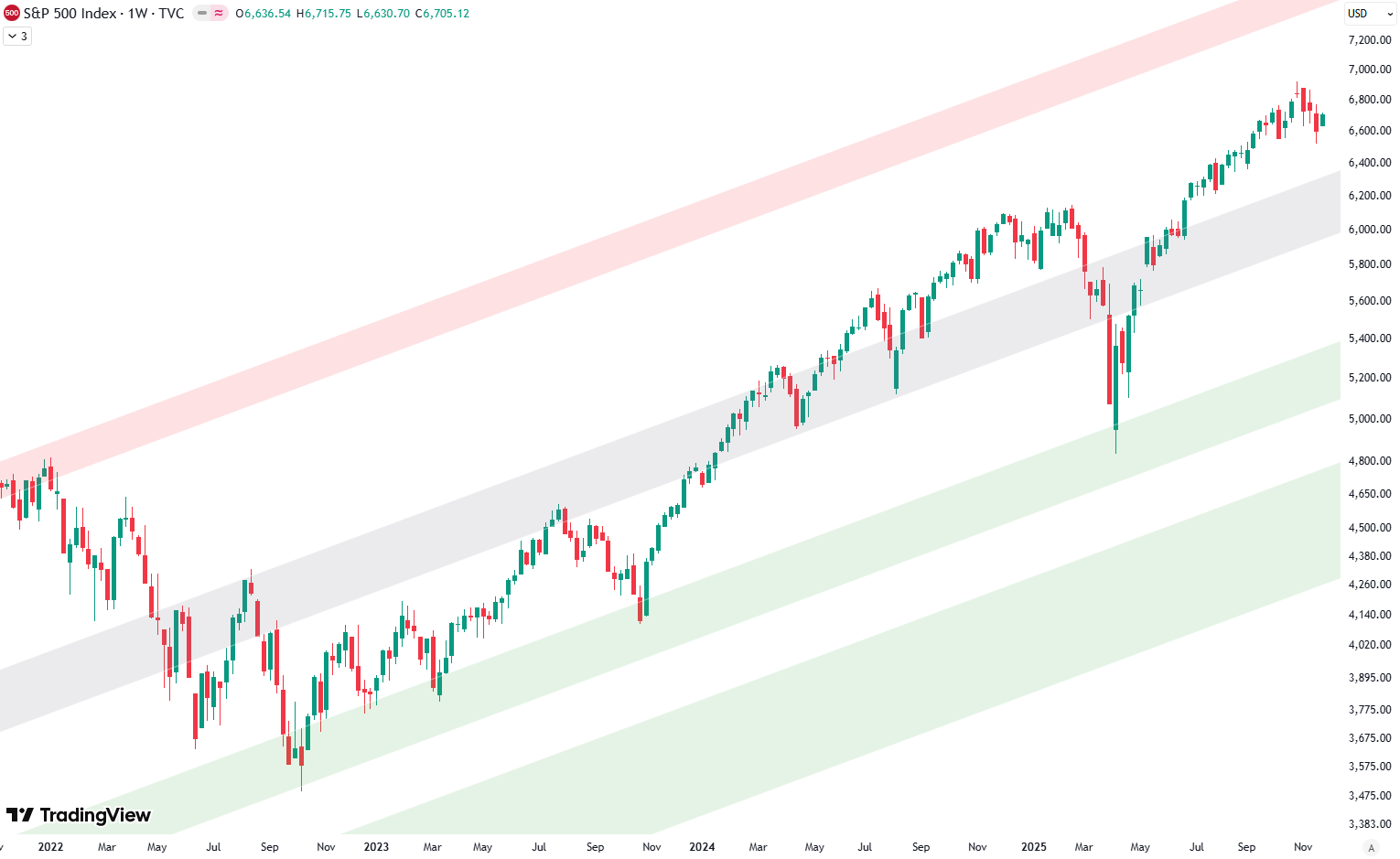
Hello and welcome to our big picture analysis of the S&P 500. We’re starting here by looking at the monthly and weekly candle charts.
We begin with the long-term trend from 2008 to today. We’re in a very clean rising trend channel, which gives us a good sense of the overall structure. To better understand the significance of certain price levels, we’ve highlighted areas on the chart: green, red, and gray shaded zones acting as trend lines.

The green shaded area represents support, found at the bottom of the trend channel. The red shaded area marks resistance, at the top. The gray shaded area runs through the middle of the channel, often acting as a balance point or intermediate support/resistance.
Are you wondering when to buy the S&P 500 as an investor? Explore our tailored services and join our growing community of do-it-yourself investors who have successfully navigated the market with our guidance.
Premium Guide
Advanced Investing Signals
Basic Guide
Basic Investing
Signals
Simple Guide
Selected
Signals
Congratulations! You’ve discovered your new free financial guide. Sign up for our most popular service, the Simple Guide.
A 7–10% Pullback Could Set Up the Next Major Rally
The weekly chart presents a compelling technical picture. Within the same long-term trend channel that originated from the 2009 low, we observe the familiar green, red, and gray shaded zones that have guided price action for more than a decade. The left portion of the chart clearly shows the 2022 market top, followed by the subsequent low, where the green shaded area provided exceptional support during that critical period.
From that foundational low, prices embarked on a sustained rally toward the February 2025 high, consistently respecting the gray shaded area as both resistance and support throughout the entire move. However, a sharp correction materialized in April, once again finding robust support precisely at the green shaded area, underlining the reliability of these technical levels.
In addition to the long-term trend channel, we can also draw a shorter-term channel that describes the current bull run beginning at the October 2022 low. This shorter-term structure again features the green, red, and gray shaded areas as key trendlines. In April, prices briefly fell out of this shorter channel to the downside, but quickly staged a strong recovery, rising sharply back into the channel.
Since July, prices rose at nearly the same angle as the gray shaded area — marked by the first red circle on the chart — followed by a brief pullback and then another strong rise. Again, prices respected the gray shaded zone as resistance, though the pullback remained shallow.
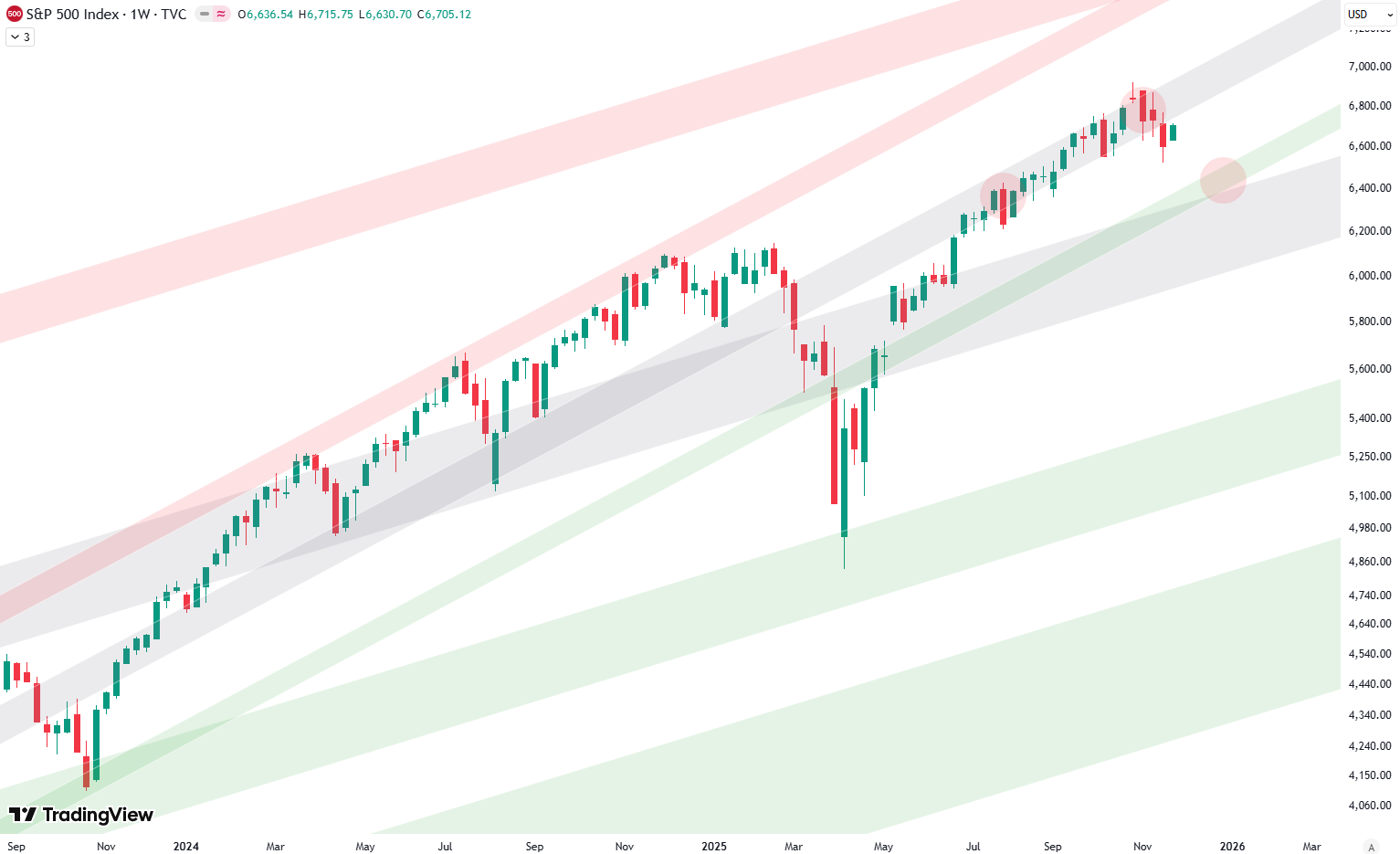
For several weeks, the chart signaled that a larger correction was likely, and that expectation has now played out. Price has been rejected once more at the gray shaded area, resulting in a decline of roughly 5% so far. The next major target lies at the green shaded area of the shorter-term trend channel. If prices fall into that zone — shown at the third red circle on the right — it would represent a decline of approximately 7–10%, depending on how far the move extends.
Such a test would offer a potential buying opportunity, as this green shaded region has repeatedly demonstrated strong support. It also aligns closely with the green shaded area of the longer-term trend channel, creating a strong confluence of support levels that could mark the next major turning point.
Leave a Reply