
Hello everybody, so this week we’ve seen quite a bit of volatility. I’m writing this about two hours after the New York open. On the 4-hour chart, you can see a significant price drop on Tuesday. We had been following this rising wedge formation, marked by the black trendlines on the 4-hour chart, and on Tuesday we broke to the downside — highlighted by the red circle.

From there, however, the market staged a very strong rebound, rallying back into the wedge formation. As of now, prices are essentially flat for the week, showing a 0% change from where we started. On Thursday we saw a powerful rally, but by Friday the S&P 500 was rejected again at the top of the wedge formation — that’s the second red circle on the chart. On Friday, weaker-than-expected U.S. job numbers also came in, which explains the sharp reaction from the boundary of this wedge formation.
Are you wondering when to buy the S&P 500 as an investor? Join our community of smart do-it-yourself investors who are making informed decisions with our expert insights, just by signing up with your email!
Premium Guide
Advanced Investing Signals
Basic Guide
Basic Investing
Signals
Simple Guide
Selected
Signals
Get started today with our free financial guide! Just enter your email, and you’ll start receiving our most popular Simple Guide with exclusive market signals right in your inbox.
Support Zone and Rising Trendline Align at Crucial Level
Turning to the daily chart, we can clearly see Tuesday’s decline, represented by a strong red candle with a long wick to the downside. Importantly, the S&P 500 was still able to close within the green shaded area, which represents the lower trendline of the upward-rising channel. This channel has been a very reliable guide for the current trend of the market.
On Thursday, prices rallied again, and by Friday we were once more testing this green shaded trendline. There is also a key horizontal support zone around 6,480 points, which is currently lining up with the same green shaded trendline. This creates a confluence of support — and that is where the market’s next direction will likely be decided.
If this confluence breaks to the downside, we could see a correction of 5–10% ahead. If the trendline and support zone hold, then another leg to the upside is possible.
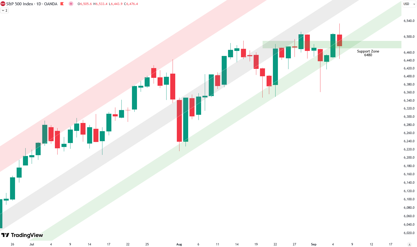
However, it’s also clear that since the end of July, prices haven’t gone anywhere in a decisive way. We’ve seen swings up and down, but they are compressing into tighter ranges. This is exactly the wedge formation we can also observe on the 4-hour chart, which suggests that energy is building in the market. The question now is whether that energy will be released to the upside or the downside. With weak seasonality in September, caution is warranted.
S&P 500: The Big PictureWe also have an article (Update: September 4, 2025) on the broader S&P 500 outlook. From a big-picture perspective, the technicals on the weekly chart are less positive and suggest that another correction could be developing in the coming weeks.
For subscribers it is very important to follow our risk management measures that we provide with all our services to protect against losses in case support zones break
Stay ahead of the market! Sign up for our weekly updates and get additional expert insights on the S&P 500, key support levels, and market trends.
S&P 500: Seasonality Insights for 2025
So far this year, the seasonal pattern for the S&P 500 has played out pretty much as expected. The first few months brought some noticeable volatility, which lines up with what we usually see in the early part of the year. Historically, January and February tend to be choppy, and that turbulence can sometimes stretch into March — and that’s exactly what happened this year.
In April, we had a sharp correction, which doesn’t line up exactly with the seasonality pattern. However, it might have been the May or June weakness playing out early this year in April. Since April, we’ve seen a very strong rise into the summer, all the way to the end of July. That, on the other hand, aligns very well with the seasonality.

Now, of course, we are looking into August and September, which are typically weak months of the year. The setup of starting a downturn in August seems to be right on time when we look at seasonality — you can see how prices in August and September tend to have big swings up and down, with a lot of volatility. Therefore, August and September should be expected to bring some weakness.
We will keep an eye on this, and then, when we come into October, we reach the strongest phase of the year. October, November, and December typically bring the year to an end with very strong seasonality. We will see if this holds true this year as well.
Of course, this isn’t a guarantee — it’s more of a roadmap based on past patterns. Ultimately, seasonal trends provide valuable context, but they must be considered alongside current market dynamics and technical analysis for a clearer picture.
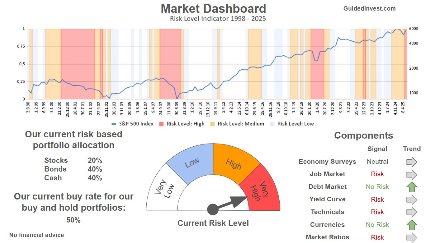
Track Market Risk with Our Dashboard
Our Market Dashboard provides a quick overview of the current market conditions and, more importantly, the associated risk. You can view a chart of one of our tools, the Risk Level Indicator, showing predicted risk from 1998 to 2025. If you are interested, you can visit our Dashboard site here.
The world of finance is complex and includes many technical terms. For explanations of these terms, I recommend using the Investopedia dictionary.
Leave a Reply