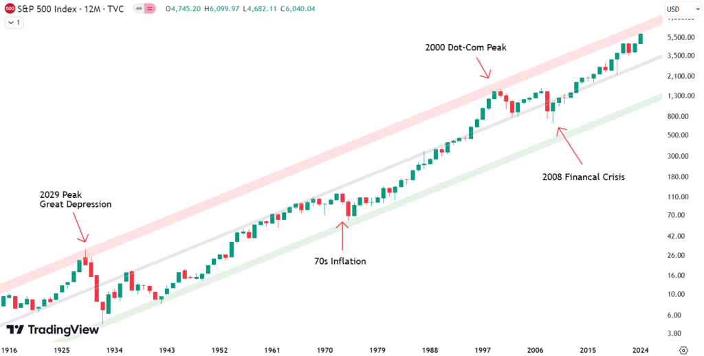
When it comes to understanding the S&P 500 on a long-term scale, there’s nothing quite like zooming out. By looking at a yearly chart, where each candle represents one year of market movement, we gain valuable perspective. Spanning more than 100 years, this approach offers clarity about where we stand today while letting us analyze key trends and interactions in historical data.
The analysis presented here uses a logarithmic chart of the S&P 500 and highlights several critical long-term trendlines, giving insights into market behavior and possible support or resistance levels in different scenarios.

The Century-Long Trend Channel
One of the most remarkable aspects of this chart is the trend channel formed using three parallel lines:
- Red Line (Upper Boundary): This line starts at the peak before the Great Depression and connects to major peaks like the dot-com bubble in 2000.
- Green Line (Lower Boundary): Established from the market’s bottom after the Great Depression, this trendline has provided support during periods like the volatile 1970s.
- Grey Line (Middle Trendline): Running parallel to the red and green lines, this middle trendline has acted as significant support and resistance over the years.
When observing this channel, it becomes evident that all three lines hold importance because of their interactions with the market’s movements over the past century.
Are you wondering when to buy the S&P 500 as an investor? Explore our tailored services and join our growing community of do-it-yourself investors who have successfully navigated the market with our guidance.
Premium Guide
Advanced Investing Signals
Basic Guide
Basic Investing
Signals
Simple Guide
Selected
Signals
Congratulations! You’ve discovered your new free financial guide. Sign up for our most popular service, the Simple Guide.
Zooming in: The Quarterly Chart
Dropping down to a quarterly chart, where each candle represents three months, the interactions with the grey middle trendline become even more visible. As highlighted in the chart, the grey trendline acted as resistance in the early 1990s. It also marked the bottom during significant moments such as the dot-com crash and the COVID-19 crash in 2020.

The alignment of these interactions emphasizes that the trendlines in this channel aren’t arbitrary—they hold real significance. As of now, the market is edging closer to the upper red trendline, a move worth watching closely.
Fine-Tuning with the Monthly Chart
Dropping further down to a monthly chart, where every candle represents one month, we can draw a new set of parallel trendlines—red, green, and grey—capturing the uptrend that began in 2008. These new trendlines form a clear channel for the market’s movement. The red line stopped the market’s advance at the 2021 peak. The green line provided strong support during the formation of the 2022 bottom. Currently, the market is above the grey line, which is expected to act as support for any declines.

Weekly Chart Insights
Looking at a weekly chart, which captures the 2022 decline followed by the sharp rise to present levels, the importance of the red, grey, and green trendlines from the 2008 uptrend becomes even more apparent. As the market moved through this volatile period, these trendlines continued to show significant interactions.

The red trendline acted as resistance during parts of the recovery, while the grey trendline provided consistent guidance, either as support or resistance, throughout the fluctuations. The green trendline, as seen before, played a key role in supporting the market at crucial points during the decline.
The picture above is from the article we published on December 26, 2024. We now have the updated weekly chart with the same trend lines. You can clearly see that all the green, gray, and red trend lines have played out very nicely.

We had that sharp decline in April and pierced through the gray shaded area. We then found support in the green shaded area at the bottom and experienced a sharp bounce from it. Currently, we are once again sitting in the gray shaded area, retesting this level.
Of course, the question now is: can the gray shaded area be flipped into support, or will it act as resistance in the coming weeks? How that will play out remains to be seen. We’ll update this again as soon as we know how prices move from here.
It’s impressive how the green, gray, and red shaded areas of the upward-sloping trend channel have once again played out so perfectly.
Why This Matters
By understanding these trendlines, beginner investors can gain confidence in interpreting long-term market trends. This approach not only gives clarity about the current state of the market but also provides a framework for anticipating how major trends might influence future market behavior.
The world of finance can be complex, with many technical terms. For explanations of financial terminology, try using the Investopedia dictionary.

Leave a Reply