
This week’s action in the S&P 500 was mostly uneventful. Take a look at the 4-hour chart below — we’re zooming in on price activity from Monday to Friday.
On Monday and Tuesday, there was a small pullback, but then the market mostly went sideways on Wednesday and Thursday. We’ve now entered a consolidation phase right at the resistance zone we pointed out last week.
But first, the green trend channel: this upward-sloping structure has been guiding the market since the April low. You can see how price has respected the upper, lower and middle bounds multiple times. This confirms a clear structure in play, and right now we’re hovering closer to the lower edge of that channel.
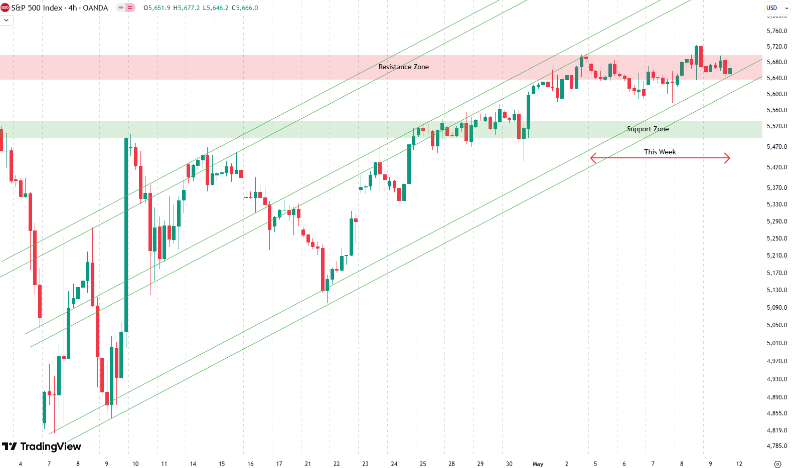
If price were to break below this lower trendline, it would mark a shift. We’d no longer be in the short-term uptrend from the April low. That could open the door for a broader consolidation or even a deeper pullback. But so far, the channel is holding.
So the big takeaway this week? Sideways movement. We’re still stuck just below resistance, and while nothing dramatic happened, we’re at a key level. A breakout or breakdown could be next.
Are you wondering when to buy the S&P 500 as an investor? Join our community of smart do-it-yourself investors who are making informed decisions with our expert insights, just by signing up with your email!
Premium Guide
Advanced Investing Signals
Basic Guide
Basic Investing
Signals
Simple Guide
Selected
Signals
Get started today with our free financial guide! Just enter your email, and you’ll start receiving our most popular Simple Guide with exclusive market signals right in your inbox.
Stalling at Resistance
The daily chart tells the bigger story. Since topping out in February, the S&P 500 moved lower until it found a strong bottom in April. What followed was a powerful rally — and a very important technical development.
Last week, we saw the index break out of the falling trend channel marked by the orange lines. That breakout was followed by a textbook retest, shown by the red circle on the chart. After confirming the breakout, prices surged upward right into the red resistance zone.

And now? Nothing much this week. Prices moved sideways and remained within this key resistance area.
This red resistance box is significant. We talked about it before — it’s a major supply zone, and it’s not uncommon to see consolidation here. Rushing straight through would be unusual. Consolidation is often how markets gather momentum for the next move.
In fact, a small pullback would be totally normal. The green zone on the chart represents a solid support area. A dip into that region could set up the next leg higher. If support holds, we could see another attempt to break through resistance. If not, things could turn lower again.
We’ll be watching closely next week. For now, price is holding steady, but we’re right at a technical decision point
For subscribers it is very important to follow our risk management measures that we provide with all our services to protect against losses in case support zones break
Stay ahead of the market! Sign up for our weekly updates and get expert insights on the S&P 500, key support levels, and market trends.
S&P 500: Seasonality Insights for 2025
So far this year, the seasonal pattern for the S&P 500 has played out pretty much as expected. The first few months brought some noticeable volatility, which lines up with what we usually see in the early part of the year. Historically, January and February tend to be choppy, and that turbulence can sometimes stretch into March — and that’s exactly what happened this year.
Looking ahead, the seasonality suggests we’re heading into a stronger period as we move toward summer. Typically, markets see some gains during this stretch, though it’s normal for there to be the occasional correction or sideways move along the way. It’s not a straight line up.

If the seasonal pattern continues to hold, we might expect a bit more volatility in May, June, and again in August and October. These months often bring correction phases or market shake-ups. Of course, this isn’t a guarantee — it’s more of a roadmap based on past patterns.
Ultimately, seasonal trends provide valuable context, but they must be considered alongside current market dynamics and technical analysis for a clearer picture.
Track Market Risk with Our Dashboard
Our Market Dashboard provides a quick overview of the current market conditions and, more importantly, the associated risk. You can view a chart of one of our tools, the Risk Level Indicator, showing predicted risk from 1998 to 2025. If you are interested, you can visit our Dashboard site here.

The world of finance is complex and includes many technical terms. For explanations of these terms, I recommend using the Investopedia dictionary.
Leave a Reply