
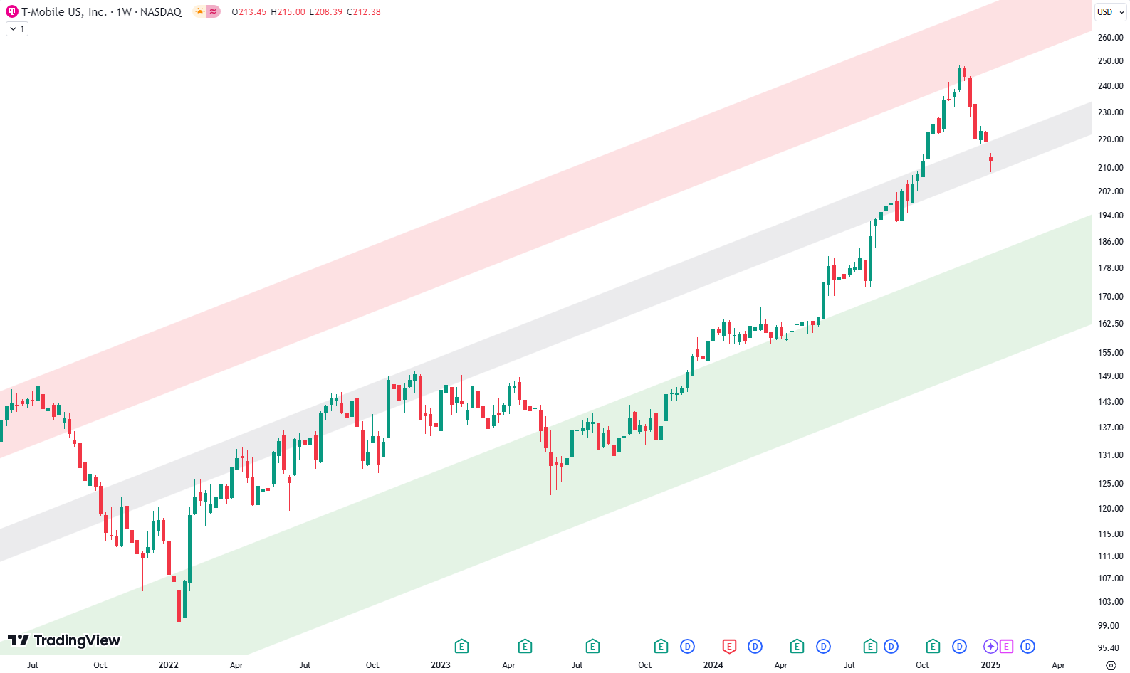
This week, we’re diving into T-Mobile’s stock with an interesting chart that dates back to 2009. This chart uses a logarithmic scale, showcasing a clear and steady trend channel defined by three parallel trendlines: the green line at the bottom, the grey line in the middle, and the red line at the top. Each line represents significant levels of support and resistance that the stock has interacted with over the years.
The green trendline serves as the primary support, marking the lower boundary of the trend channel. Meanwhile, the red trendline at the top acts as a strong resistance level. The grey trendline in the middle is particularly notable, as it has often shifted between acting as support and resistance. Together, these trendlines reveal T-Mobile’s long-term price movement and provide insights into potential opportunities.

A key observation is the grey trendline’s tendency to act more frequently as resistance than support. Historically, when prices have risen to the red trendline at the top, they’ve encountered resistance, prompting a correction. These corrections often led to prices falling through the grey trendline instead of holding at that level. It’s at the green trendline where support is typically found, allowing prices to bounce back. On the way up again, the grey trendline tends to act as resistance, creating a consistent cycle within this trend channel.
Are you wondering when to buy T-Mobile as an investor? Explore our tailored services and join our growing community of do-it-yourself investors who have successfully navigated the market with our guidance.
Premium Guide
Advanced Investing Signals
Basic Guide
Basic Investing
Signals
Simple Guide
Selected
Signals
Congratulations! You’ve discovered your new free financial guide. Sign up for our most popular service, the Simple Guide.
Recent Movements on the Weekly Chart
On the weekly chart, T-Mobile’s stock recently hit the red trendline and has since corrected downward, approaching the grey trendline. This level is crucial to watch, as it could potentially offer support. If the grey trendline holds, it may present an interesting buying opportunity for investors. However, if prices break below the grey trendline, the stock might head toward the green trendline, where another solid buying opportunity could emerge in the green shaded area.
The Value of Long-Term Trendlines
What makes these long-term trendlines so valuable is their reliability over extended periods. Since 2009, T-Mobile’s price movements have consistently respected these trendlines, adding confidence to their predictive power. Long-term charts like this often reveal patterns that shorter-term views may miss, giving investors a clearer picture of major support and resistance levels.
For now, we’ll keep an eye on how T-Mobile’s stock interacts with the grey trendline and whether it holds up as support or breaks down further. If it heads toward the green trendline, history suggests it could mark another compelling opportunity. We’ll continue monitoring the situation and look forward to updating you as the story unfolds.
The world of finance can be complex, with many technical terms. For explanations of financial terminology, try using the Investopedia dictionary.
Leave a Reply