
Hello and welcome to our big picture analysis of the S&P 500. We’re starting here by looking at the monthly and weekly candle charts.
The long-term trend since 2008
We begin with the long-term trend from 2008 to today. We’re in a very clean rising trend channel, which gives us a good sense of the overall structure. To better understand the significance of certain price levels, we’ve highlighted areas on the chart: green, red, and gray shaded zones acting as trend lines.
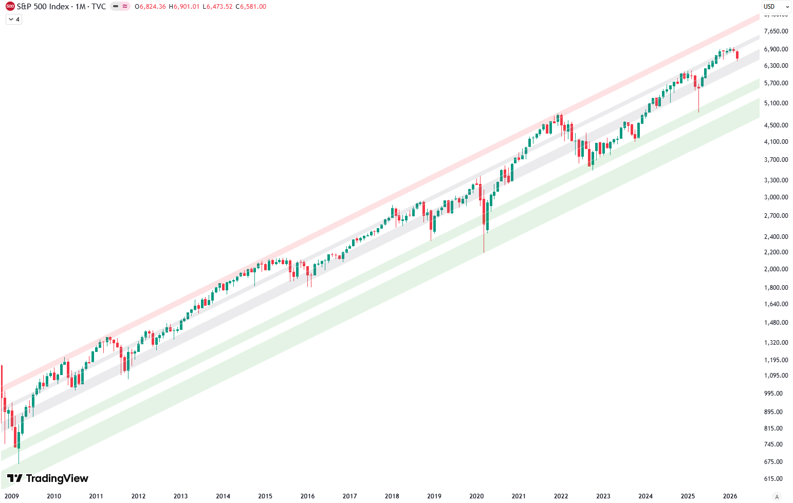
The green shaded area represents support, found at the bottom of the trend channel. The red shaded area marks resistance, at the top. The gray shaded areas run through the middle of the channel, often acting as a balance point or intermediate support/resistance.
Are you wondering when to buy the S&P 500 as an investor? Explore our tailored services and join our growing community of do-it-yourself investors who have successfully navigated the market with our guidance.
Premium Guide
Advanced Investing Signals
Basic Guide
Basic Investing
Signals
Simple Guide
Selected
Signals
Congratulations! You’ve discovered your new free financial guide. Sign up for our most popular service, the Simple Guide.
Interaction with the long-term trend
The weekly chart continues to present a compelling technical structure. Price remains within the long-term trend channel that originated at the 2009 low. For more than a decade, the green, gray, and red shaded zones have consistently guided market behavior, acting as reliable areas of support and resistance.
The left side of the chart clearly illustrates the 2022 market top, followed by the subsequent decline into the bear market low. During that critical phase, the green shaded area provided exceptional support, forming the foundation for the next major advance. From that low, the market launched into a sustained rally toward the February 2025 high, repeatedly finding support at the green shaded zone, as marked on the chart.
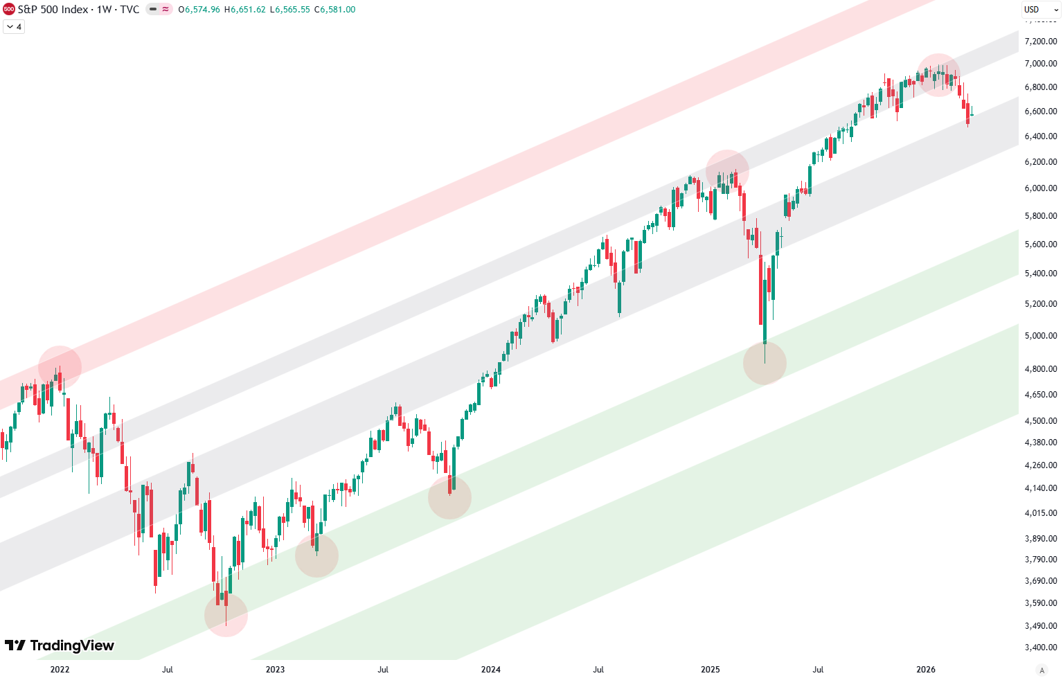
Throughout this advance, the gray shaded area alternated between resistance and support, effectively guiding the entire upward move. Even the sharp correction in April once again found precise support at the green shaded zone, reinforcing the technical reliability of these long-term levels.
The short-term trend
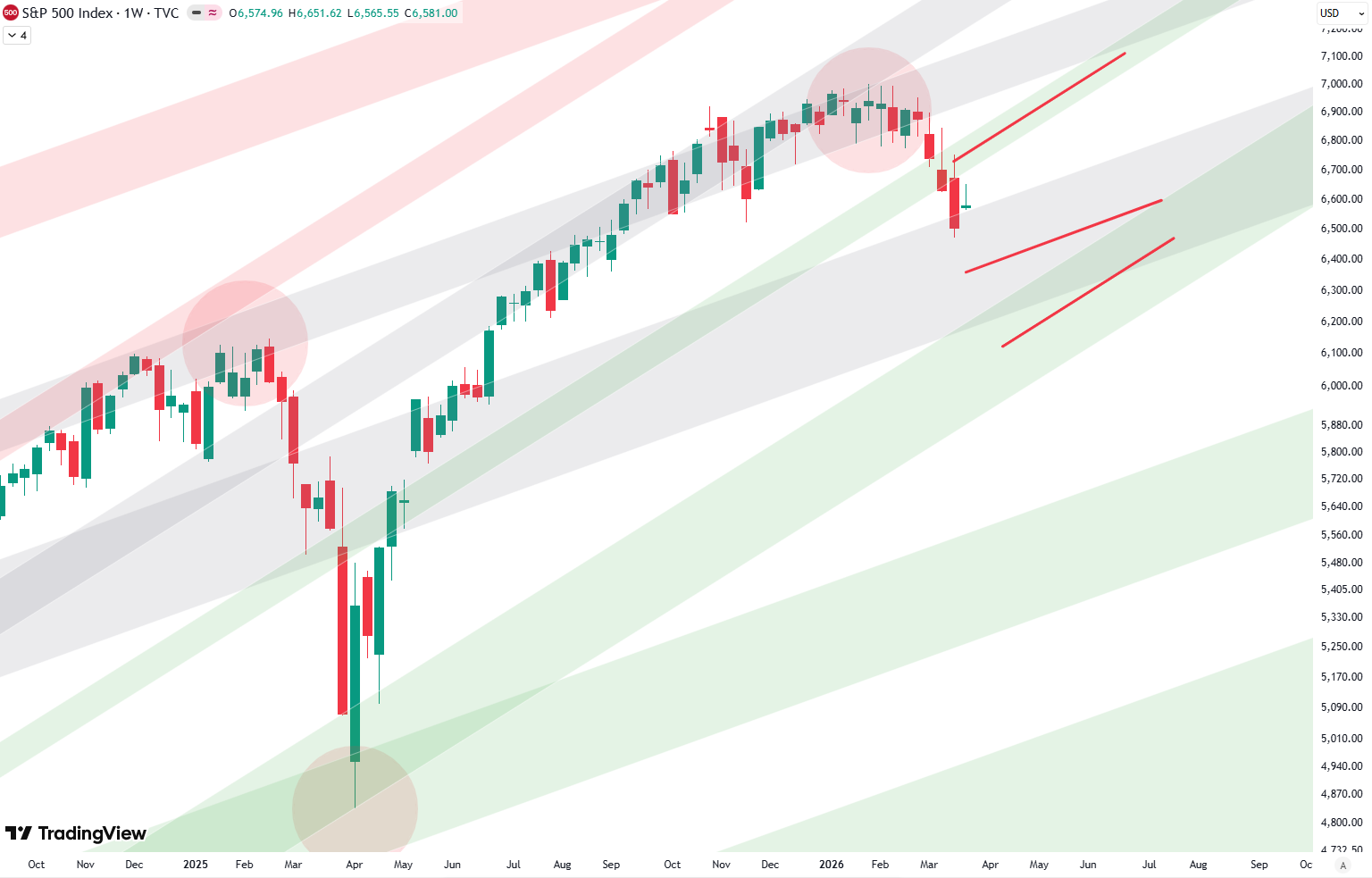
Beyond the primary channel, a shorter-term trend channel can be drawn starting from the October 2022 low, describing the current bull run in greater detail. This structure again incorporates the familiar green, red, and gray zones as dynamic boundaries. In April, prices briefly broke below this shorter-term channel but quickly reversed and reclaimed it, signaling continued underlying strength.
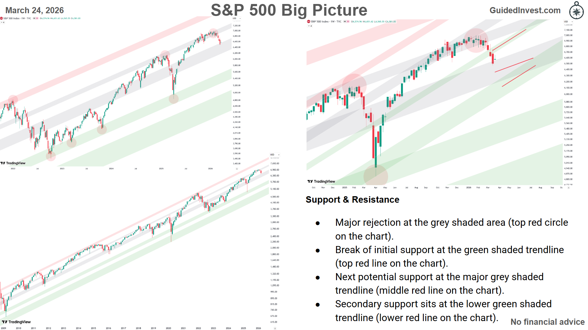
Support & Resistance
- Major rejection at the grey shaded area (top red circle on the chart).
- Break of initial support at the green shaded trendline (top red line on the chart).
- Next potential support at the major grey shaded trendline (middle red line on the chart).
- Secondary support sits at the lower green shaded trendline (lower red line on the chart).
Dashboard
All information summarized in our dashboard:
Leave a Reply