
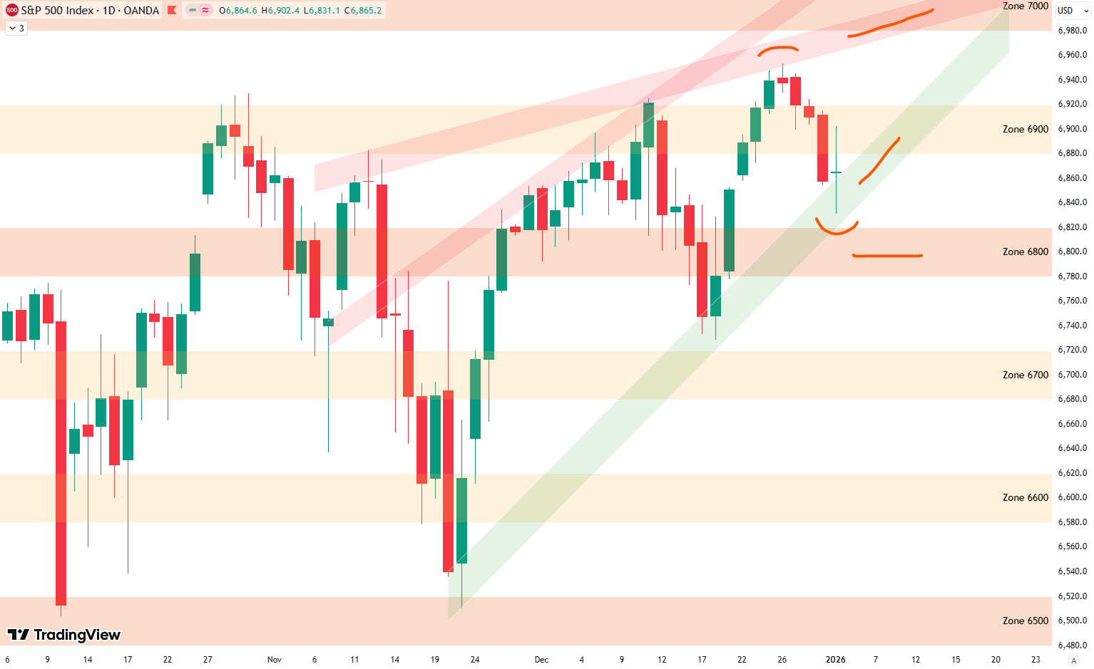
Hello everybody, and welcome to this week’s analysis of the S&P 500. We had a somewhat weak week, with the index down about 1%. Looking at the 4-hour chart, we can see this week’s price action clearly. After reaching a new all-time high last Friday, just after Christmas, the market started to decline from Monday onward. The selling pressure increased slightly into Thursday, followed by a small bounce on Friday. However, there was a larger sell-off late on Friday, which gives the move a more controlled, orderly look rather than anything panic-driven. So for now, there is nothing alarming in this price action.

That said, we have clearly lost the 6,900-point zone, as shown on the chart, and prices are now moving lower toward the important 6,800-point support area. A test of this zone is very likely, and it could also be an area where a short-term bottom forms. I marked this potential support zone in red on the chart.
Are you wondering when to buy the S&P 500 as an investor? Join our community of smart do-it-yourself investors who are making informed decisions with our expert insights, just by signing up with your email!
Premium Guide
Advanced Investing Signals
Basic Guide
Basic Investing
Signals
Simple Guide
Selected
Signals
Get started today with our free financial guide! Just enter your email, and you’ll start receiving our most popular Simple Guide with exclusive market signals right in your inbox.
Price Stalls at Lower Trend Line of Daily Formation
Taking a closer look at the daily chart, you can see how we highlighted the 6,900-point zone last week. More importantly, there is the rising green shaded trend line, which we are using as part of this rising wedge formation. Price is now stalling exactly at this level. We had the recent high last week, which I marked in red, and from there price started to roll over.
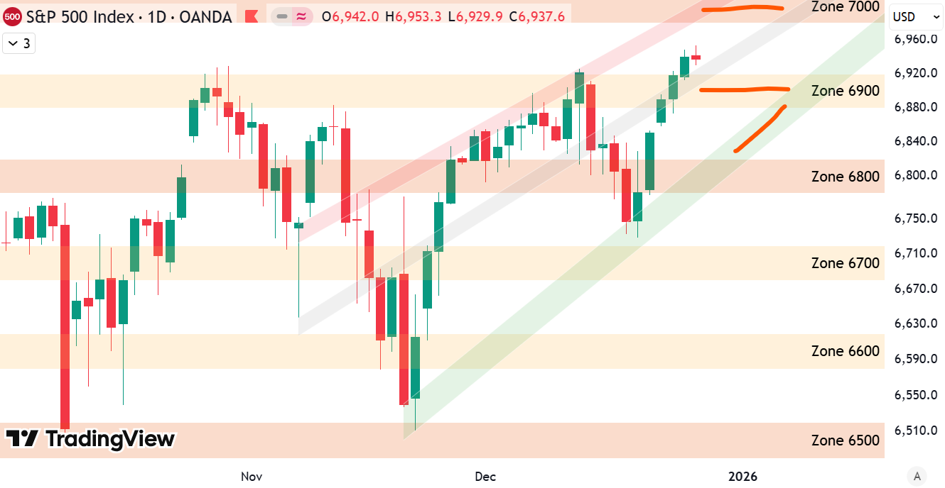
We can now also draw a new upper trend line, marked by the red shaded area, which does a better job of capturing the overall rising wedge structure. Price tested this upper boundary nicely last week and then dropped into the end of the week. The current low sits right at the green shaded area — the lower boundary of this rising wedge — which I also marked in red on the chart.
For now, this green shaded trend line is holding as support. I also added red horizontal lines to highlight the key support and resistance zones. On the upside, the red shaded area aligns with the major resistance zone near 7,000 points, which defines the upper boundary of this formation. On the downside, if the green shaded support area were to break, the next important support would be the 6,800-point zone, which could again provide stabilization. How price reacts around these levels next week will be very important.
Short-Term Risk Outlook
Finally, let’s look at the short-term risk outlook and buy/sell score. The S&P 500 is shown in black, the buy score in green, and the sell score in red. On the bottom, you can see the longer-term chart going back to the major low in October 2022. On the top right, we have a zoomed-in view of the last year, and on the top left, the resulting buy and sell signals generated by this indicator.
The recent buy signals did an excellent job of capturing the last two market bottoms. At the moment, we have not received a sell signal yet. On the top-right chart, you can see that both a buy score and a sell score are starting to develop at the same time. I marked this with two red lines. Neither score is very high yet, but both are close to levels that could trigger either a buy or a sell signal.
This means it is quite possible that we get either a buy signal or a sell signal next week. If that happens, it will of course be shared through our free email service.

Overall, since October the market has been moving mostly sideways, without making much net progress. When markets consolidate for a longer period like this, they tend to build up energy. Eventually, that energy gets released in a larger move, either to the upside or to the downside. Because of that, I expect volatility to increase in the near future, with a more decisive move likely ahead.
We also have an article (Update: December 25, 2025) on the broader S&P 500 outlook. From a big-picture perspective, the technicals on the weekly chart are less positive and suggest that another correction could be developing in the coming weeks.
For subscribers it is very important to follow our risk management measures that we provide with all our services to protect against losses in case support zones break
Stay ahead of the market! Sign up for our weekly updates and get additional expert insights on the S&P 500, key support levels, and market trends.
S&P 500: Seasonality Insights for 2026
When we look at the seasonality of the S&P 500, the last quarter of 2025 did not line up very well with the typical seasonal pattern. That’s not a problem, though — seasonality should be seen more like a weather model. It gives us a possible direction the market could take, not a precise forecast.
We did see weakness in October, which actually matched the seasonal pattern, as seasonality often points to a softer October. However, we did not get the strong year-end rally that seasonality would normally suggest.
Looking ahead to the first quarter of 2026, the seasonal pattern points to potential weakness in January, followed by rising prices in February, with a possible peak during that month. After that, seasonality suggests renewed weakness into March to start the year. We’ll have to see whether the market follows this pattern.

Seasonality isn’t a perfect roadmap — it rarely plays out exactly the same way each year. But it does offer useful context. Right now, it suggests that while the broader trend remains positive into year-end, a short-term correction could still unfold before the next strong push higher into December.
Of course, this isn’t a guarantee — it’s more of a roadmap based on past patterns. Ultimately, seasonal trends provide valuable context, but they must be considered alongside current market dynamics and technical analysis for a clearer picture.
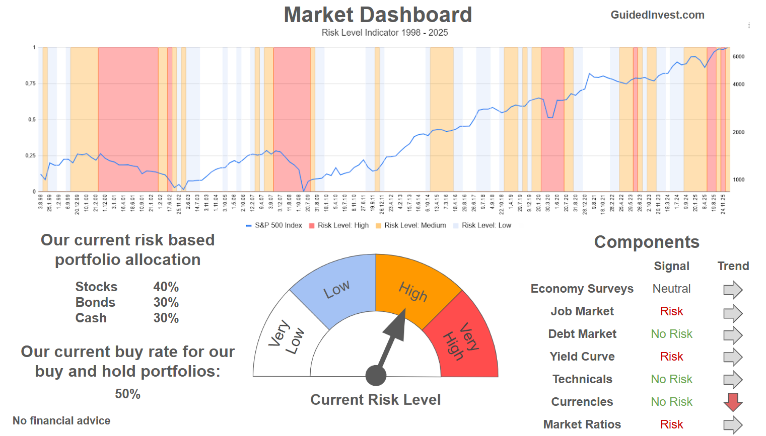
Track Market Risk with Our Dashboard
Our Market Dashboard provides a quick overview of the current market conditions and, more importantly, the associated risk. You can view a chart of one of our tools, the Risk Level Indicator, showing predicted risk from 1998 to 2025. If you are interested, you can visit our Dashboard site here.
The world of finance is complex and includes many technical terms. For explanations of these terms, I recommend using the Investopedia dictionary.
Leave a Reply