
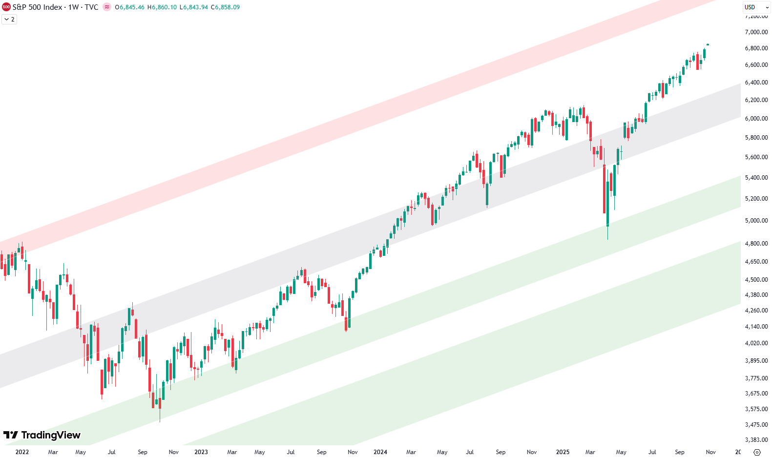
Hello and welcome to our big picture analysis of the S&P 500. We’re starting here by looking at the monthly and weekly candle charts.
We begin with the long-term trend from 2008 to today. We’re in a very clean rising trend channel, which gives us a good sense of the overall structure. To better understand the significance of certain price levels, we’ve highlighted areas on the chart: green, red, and gray shaded zones acting as trend lines.

The green shaded area represents support, found at the bottom of the trend channel. The red shaded area marks resistance, at the top. The gray shaded area runs through the middle of the channel, often acting as a balance point or intermediate support/resistance.
Are you wondering when to buy the S&P 500 as an investor? Explore our tailored services and join our growing community of do-it-yourself investors who have successfully navigated the market with our guidance.
Premium Guide
Advanced Investing Signals
Basic Guide
Basic Investing
Signals
Simple Guide
Selected
Signals
Congratulations! You’ve discovered your new free financial guide. Sign up for our most popular service, the Simple Guide.
Short-Term Channel Suggests 5–10% Correction Possible
The weekly chart presents a compelling technical picture. Within the same long-term trend channel that originated from the 2009 low, we observe the familiar green, red, and gray shaded zones that have guided price action for more than a decade. The left portion of the chart clearly shows the 2022 market top, followed by the subsequent low, where the green shaded area provided exceptional support during that critical period.
From that foundational low, prices embarked on a sustained rally toward the February 2025 high, consistently respecting the gray shaded area as both resistance and support throughout the entire move. However, a sharp correction materialized in April, once again finding robust support precisely at the green shaded area, underlining the reliability of these technical levels.
In addition to the long-term trend channel, we can also draw a shorter-term channel that describes the current bull run beginning at the October 2022 low. This shorter-term structure again features the green, red, and gray shaded areas as key trendlines. In April, prices briefly fell out of this shorter channel to the downside, but quickly staged a strong recovery, rising sharply back into the channel.
For the last several months, price action has been hovering around the gray shaded area of this shorter-term channel. This is highlighted by two red circles on the chart. The first marks a pullback but that was followed by another strong rally, again rising at the same angle as the gray zone. Since then, prices have remained within this region, reflecting both the strength and persistence of the trend.
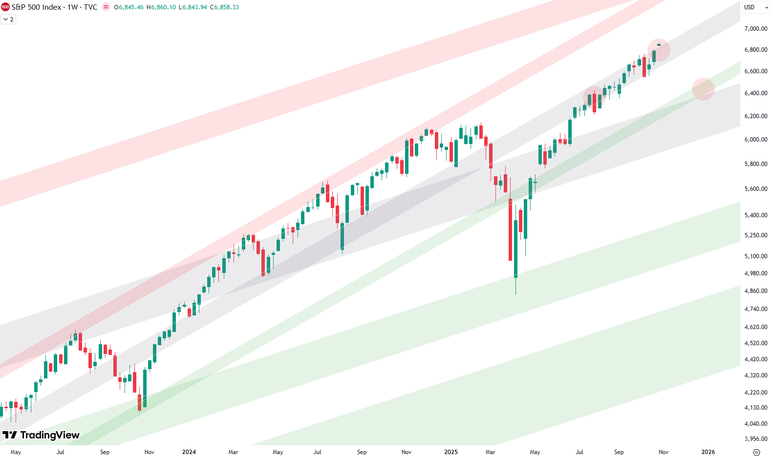
This leaves the market at a pivotal point. A sustained breakout above the gray shaded area — where the middle red circle is marked — would postpone the possibility of a deeper pullback, allowing the rally to extend further. However, the more likely scenario is that the gray shaded area continues to act as resistance. It has capped prices for months, and at some point, rejection from this level may occur. In that case, a deeper correction of perhaps 5–10% becomes probable, with a logical retest of the green shaded area of the short-term channel.
Such a move would also align with the broader green shaded support zone from the longer-term trend channel, creating strong confluence. If reached, this would provide a technically significant test and an area where support could again reassert itself.
Leave a Reply