
Welcome to this week’s analysis of the S&P 500. After last week’s sharp drop, which we discussed in detail, the index rebounded strongly, gaining about 2.6% this week. On the 4-hour chart, we can see how the week started with a strong open on Monday, moving above the 6,600 support zone. Throughout the week, there were several swings — brief declines midweek and another drop on Friday — but each was followed by a strong recovery.

We can also draw a set of trendlines that nicely describe the current short-term downtrend structure. The lower trendline has acted as support, while the upper one has served as resistance, and the middle trendlines have provided both support and resistance during the week. These levels will continue to be important in the sessions ahead.
Are you wondering when to buy the S&P 500 as an investor? Join our community of smart do-it-yourself investors who are making informed decisions with our expert insights, just by signing up with your email!
Premium Guide
Advanced Investing Signals
Basic Guide
Basic Investing
Signals
Simple Guide
Selected
Signals
Get started today with our free financial guide! Just enter your email, and you’ll start receiving our most popular Simple Guide with exclusive market signals right in your inbox.
Market Stabilizes After Last Week’s Drop, But Resistance Remains Strong
On the daily chart, the same trendlines from the 4-hour view help guide the analysis of this ongoing corrective phase. Three key horizontal zones remain in focus: 6,500, 6,600, and 6,700. Price has repeatedly tested these zones, showing how significant they are. Currently, the S&P 500 is hovering near the lower boundary around 6,700, which serves as resistance. The question for the coming week will be whether prices can break through this resistance or if another rejection follows.
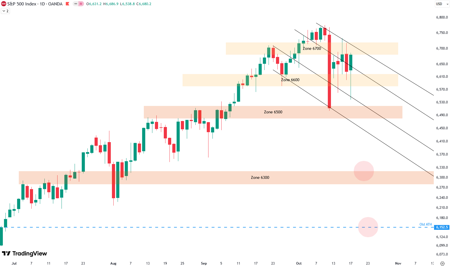
We also continue to watch the downside targets we discussed last week, marked by the two red circles on the chart. The first lies around 6,300 points, a major support level and a reasonable first downside target. The second potential target is lower, it is the old all-time high from before the April drop. That area could also provide strong support if the market turns lower again. For now, we’ll see how this corrective move develops in the coming sessions.
Short-Term Risk Outlook
Looking at the S&P 500’s short-term risk chart, we can observe that after spending several months in the red zone — which indicated overbought conditions and high downside risk — the index has now shifted into the green zone. This green area signals a period of lower short-term risk. The shift occurred after Monday’s new buy signal (marked by a vertical green line on the chart).
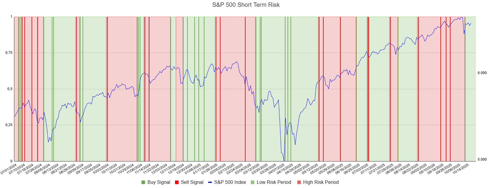
Typically, this lower-risk phase appears after a significant decline, when prices have already corrected meaningfully. That often provides a good environment for new buying opportunities. However, being in a low-risk zone doesn’t mean prices can’t fall further — as we’ve seen in past instances, additional downside can still occur. This is why we often see several consecutive buy signals in such conditions: they tend to produce favorable average entry prices over time.
We also have an article (Update: October 2, 2025) on the broader S&P 500 outlook. From a big-picture perspective, the technicals on the weekly chart are less positive and suggest that another correction could be developing in the coming weeks.
For subscribers it is very important to follow our risk management measures that we provide with all our services to protect against losses in case support zones break
Stay ahead of the market! Sign up for our weekly updates and get additional expert insights on the S&P 500, key support levels, and market trends.
S&P 500: Seasonality Insights for 2025
So far this year, the seasonal pattern for the S&P 500 has played out pretty much as expected. The first few months brought some noticeable volatility, which lines up with what we usually see in the early part of the year. Historically, January and February tend to be choppy, and that turbulence can sometimes stretch into March — and that’s exactly what happened this year.
In April, however, we experienced a sharp correction. That move doesn’t align perfectly with the usual seasonal pattern, but it may have represented the weakness that typically shows up in May or June arriving a bit earlier than usual. From that April low, the market rallied strongly through the summer, continuing higher into late July — a period that generally aligns well with historical seasonality.
However, the typical seasonal soft spot in August and September didn’t really appear this year. Usually, those two months bring some volatility or a correction phase, but the S&P 500 instead continued to trade with strength, avoiding any meaningful pullback.

Looking ahead to the remainder of the year — October, November, and December — these months are historically the strongest period of the year for the S&P 500. But given that we’ve already seen such a strong summer rally and skipped the usual correction phase, it’s reasonable to expect that some of that weakness may still be due.
In other words, the correction that typically occurs in late summer might simply have been delayed rather than avoided altogether. That means we could see it emerge in October or November before the market resumes its usual year-end strength.
Seasonality isn’t a perfect roadmap — it rarely plays out exactly the same way each year. But it does offer useful context. Right now, it suggests that while the broader trend remains positive into year-end, a short-term correction could still unfold before the next strong push higher into December.
Of course, this isn’t a guarantee — it’s more of a roadmap based on past patterns. Ultimately, seasonal trends provide valuable context, but they must be considered alongside current market dynamics and technical analysis for a clearer picture.
Track Market Risk with Our Dashboard
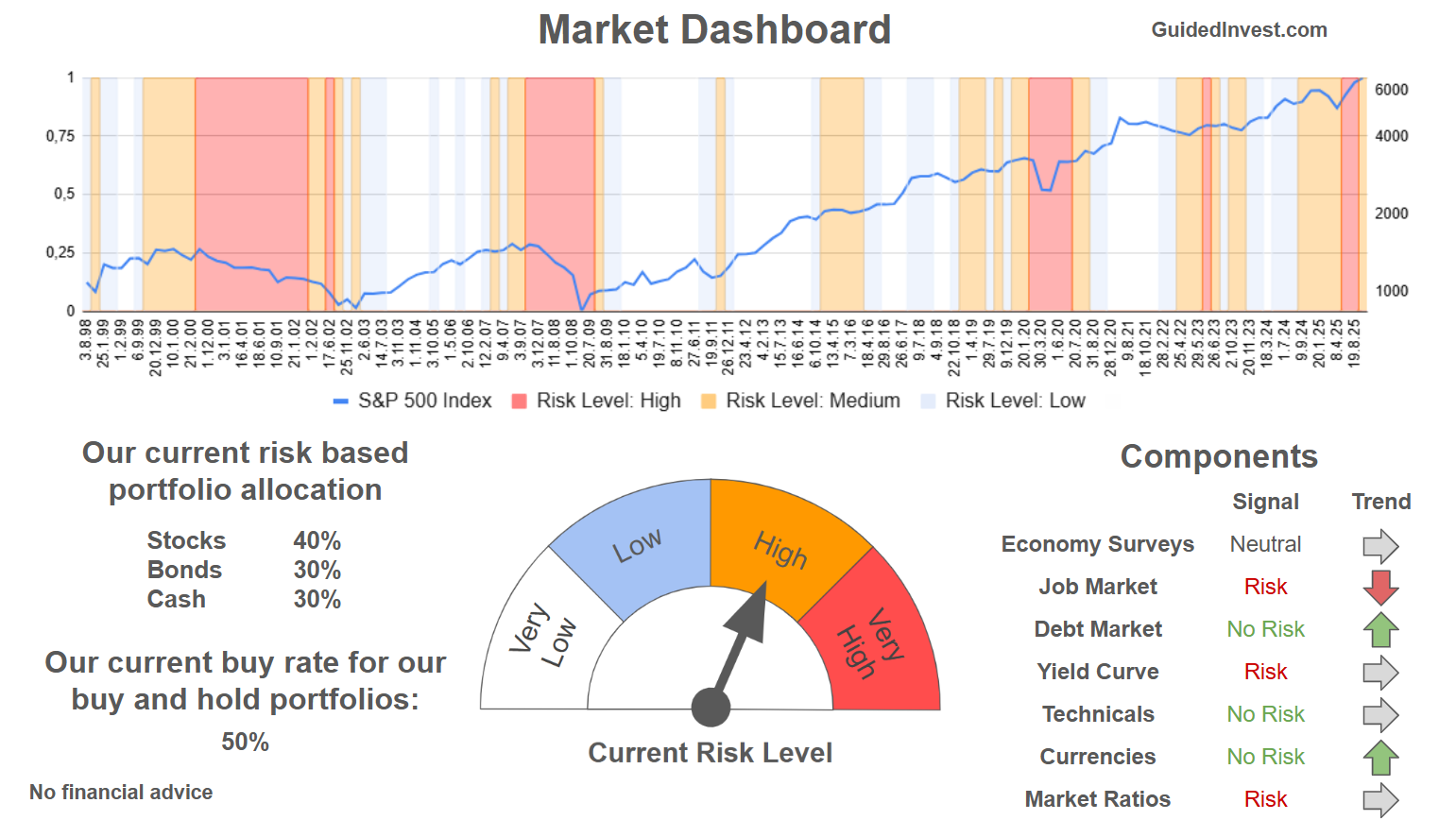
Our Market Dashboard provides a quick overview of the current market conditions and, more importantly, the associated risk. You can view a chart of one of our tools, the Risk Level Indicator, showing predicted risk from 1998 to 2025. If you are interested, you can visit our Dashboard site here.
The world of finance is complex and includes many technical terms. For explanations of these terms, I recommend using the Investopedia dictionary.
Leave a Reply