
Hello everybody, and welcome to this week’s analysis of the S&P 500. The index finished 1% up this week, marking a good performance despite the government shutdown in the US. The shutdown remains unresolved, and it’s still unclear how long it will continue. Historically, such events have sometimes affected the S&P 500 — though the impact has varied. In this case, the market’s reaction so far suggests a “buy the dip” scenario, but we’ll have to see how things develop.
Looking at the 4-hour chart, we saw a mild correction early in the week — from Monday through midweek — followed by a sideways phase with limited movement. Then, late on Wednesday, the market surged higher, breaking decisively above the 6,700-point zone, which had served as resistance last week. Prices closed the day above that level and retested it on Friday.

This breakout means we now have a support area just below current prices — around the 6,700 level — which also aligns closely with the green shaded area from the daily trend channel. That confluence creates a solid technical foundation for potential higher prices going forward.
Are you wondering when to buy the S&P 500 as an investor? Join our community of smart do-it-yourself investors who are making informed decisions with our expert insights, just by signing up with your email!
Premium Guide
Advanced Investing Signals
Basic Guide
Basic Investing
Signals
Simple Guide
Selected
Signals
Get started today with our free financial guide! Just enter your email, and you’ll start receiving our most popular Simple Guide with exclusive market signals right in your inbox.
Market Still Overextended After Months Without Correction
On the daily chart, we can clearly see how last week’s test of the 6,600 support zone aligned perfectly with the green shaded trendline of the broader uptrend channel. That test formed a long lower wick on the daily candle, showing strong buying interest and a push higher afterward. Similarly, this week, we saw another bullish reaction — a strong candle on Wednesday that once again touched the green shaded area of the trend channel before breaking through the 6,700-point resistance zone. After the breakout, prices consolidated for the rest of the week.
By Friday, we had an indecision candle — a doji — suggesting some hesitation at current levels. This could signal short-term resistance above, though it’s not a strong reversal signal by itself.

Last week, our outlook was slightly bearish, anticipating a possible pullback. However, that was not confirmed — the opposite occurred, with a clear move to the upside. Still, we’re now back in overbought territory, meaning the market is stretched again. In such strong bull markets, meaningful pullbacks are often the best entry opportunities, so patience remains important.
Our short-term risk indicator continues to show a red shaded area, which indicates a period of elevated risk. This remains a concern because the market has been overbought for an extended period — and we haven’t seen a meaningful correction since April.
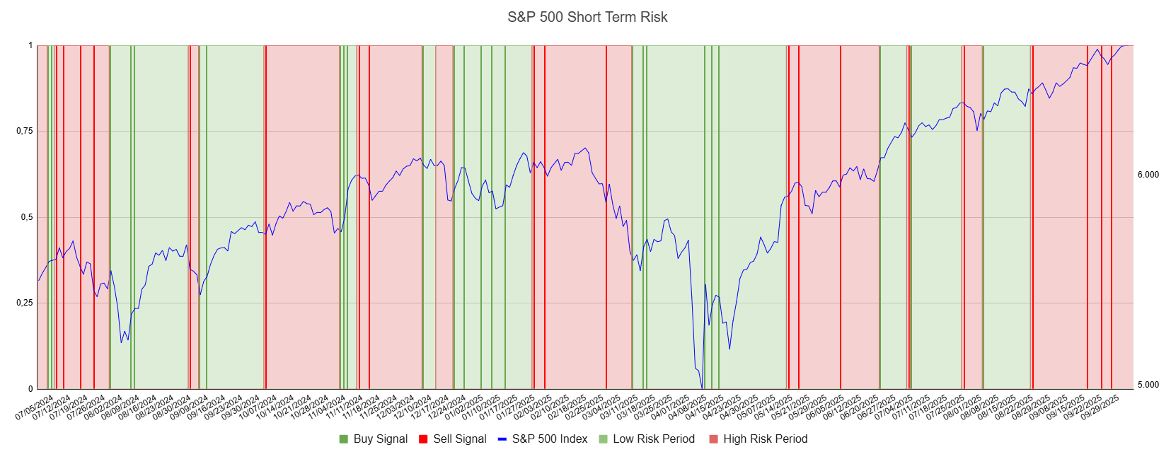
Looking at the S&P 500 chart paired with the short-term risk indicator, it’s clear that a 5–10% correction is overdue. Such a pullback would help reset conditions and allow for a healthier continuation of the longer-term uptrend. Until that happens, traders should remain cautious, as the market remains stretched to the upside.
We also have an article (Update: October 2, 2025) on the broader S&P 500 outlook. From a big-picture perspective, the technicals on the weekly chart are less positive and suggest that another correction could be developing in the coming weeks.
For subscribers it is very important to follow our risk management measures that we provide with all our services to protect against losses in case support zones break
Stay ahead of the market! Sign up for our weekly updates and get additional expert insights on the S&P 500, key support levels, and market trends.
S&P 500: Seasonality Insights for 2025
So far this year, the seasonal pattern for the S&P 500 has played out pretty much as expected. The first few months brought some noticeable volatility, which lines up with what we usually see in the early part of the year. Historically, January and February tend to be choppy, and that turbulence can sometimes stretch into March — and that’s exactly what happened this year.
In April, however, we experienced a sharp correction. That move doesn’t align perfectly with the usual seasonal pattern, but it may have represented the weakness that typically shows up in May or June arriving a bit earlier than usual. From that April low, the market rallied strongly through the summer, continuing higher into late July — a period that generally aligns well with historical seasonality.
However, the typical seasonal soft spot in August and September didn’t really appear this year. Usually, those two months bring some volatility or a correction phase, but the S&P 500 instead continued to trade with strength, avoiding any meaningful pullback.

Looking ahead to the remainder of the year — October, November, and December — these months are historically the strongest period of the year for the S&P 500. But given that we’ve already seen such a strong summer rally and skipped the usual correction phase, it’s reasonable to expect that some of that weakness may still be due.
In other words, the correction that typically occurs in late summer might simply have been delayed rather than avoided altogether. That means we could see it emerge in October or November before the market resumes its usual year-end strength.
Seasonality isn’t a perfect roadmap — it rarely plays out exactly the same way each year. But it does offer useful context. Right now, it suggests that while the broader trend remains positive into year-end, a short-term correction could still unfold before the next strong push higher into December.
Of course, this isn’t a guarantee — it’s more of a roadmap based on past patterns. Ultimately, seasonal trends provide valuable context, but they must be considered alongside current market dynamics and technical analysis for a clearer picture.
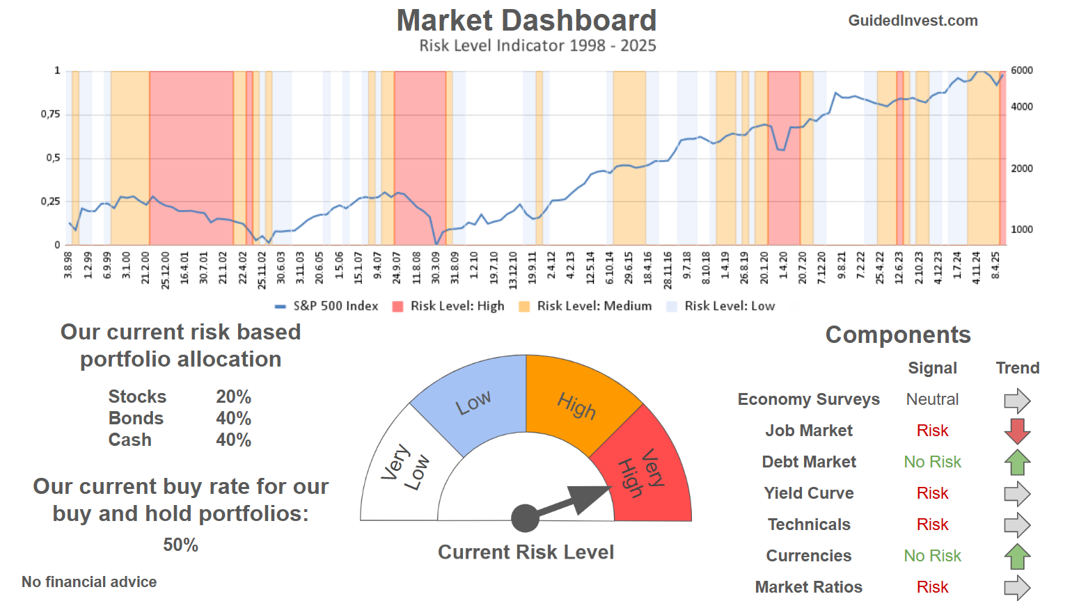
Track Market Risk with Our Dashboard
Our Market Dashboard provides a quick overview of the current market conditions and, more importantly, the associated risk. You can view a chart of one of our tools, the Risk Level Indicator, showing predicted risk from 1998 to 2025. If you are interested, you can visit our Dashboard site here.
The world of finance is complex and includes many technical terms. For explanations of these terms, I recommend using the Investopedia dictionary.
Leave a Reply