
Hello everybody, so we had quite a strong week. The S&P 500 gained around 1.3% for the week. On the 4-hour chart, you can see the black trend lines marking the wedge formation we discussed last week. We broke out of that wedge, and on Wednesday we had a nice retest of the formation from above (marked by the red circle on the chart).
Also on Wednesday, we had the Fed meeting, where they cut rates by 25 basis points as expected. This introduced some volatility, and during this spike we saw that retest of the wedge. Afterward, the market continued higher.

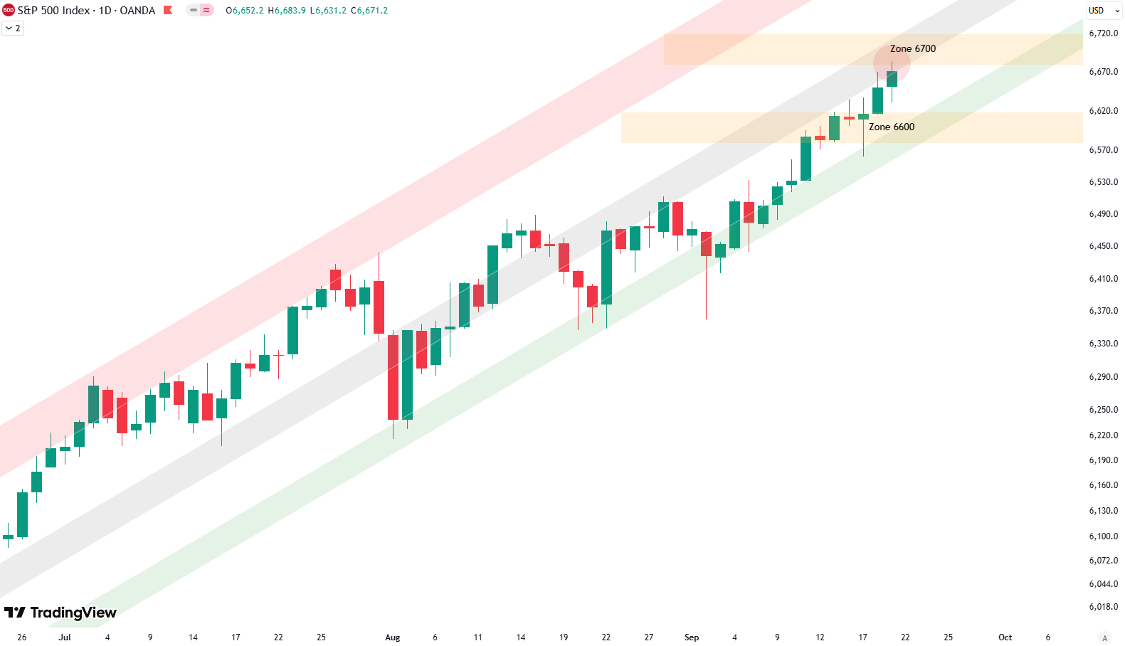
On the 4-hour chart, you can also draw a new trend line, marked here in green. This shows the sharp uptrend of the last two weeks very clearly. We will watch that closely in case it gets broken it could be the first signal of a bigger downturn. Recently, the market found support at the 6,600 zone and is now pushing upward toward the 6,700 zone. On Friday, we already saw some rejection at this level, so we’ll see how far prices can push into this 6,700 resistance zone.
Are you wondering when to buy the S&P 500 as an investor? Join our community of smart do-it-yourself investors who are making informed decisions with our expert insights, just by signing up with your email!
Premium Guide
Advanced Investing Signals
Basic Guide
Basic Investing
Signals
Simple Guide
Selected
Signals
Get started today with our free financial guide! Just enter your email, and you’ll start receiving our most popular Simple Guide with exclusive market signals right in your inbox.
Seasonal Weakness Adds Weight to Daily Resistance
Now, looking at the daily chart, you can see the green, gray, and red shaded areas marking the trend channel. The market has pushed up from the green shaded area at the bottom of the channel and is now touching the gray middle area, which should act as resistance. At the same time, we’re testing the 6,700 resistance zone. This creates a confluence of resistance levels. On top of that, the daily RSI is above 70, signaling an overbought condition. So, caution is warranted here.
We also want to introduce a new measure: the short-term risk indicator. It is composed of several signals from different asset classes. In the chart, the S&P 500 is shown in blue since July last year. The green and red shaded areas mark low- and high-risk environments, while the vertical green and red lines show buy and sell signals delivered by this indicator.
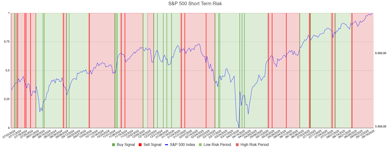
Currently, for the past few weeks, we’ve been in the red shaded high-risk area. This doesn’t necessarily mean we must expect a deep downturn, but it suggests limited upside potential. Sometimes it simply results in sideways movement. Combined with the RSI above 70 on the daily chart and the fact that we’re now entering the second half of September — historically the weakest seasonal period of the year — the message is clear: be careful here. We’ll see what happens next week.
We also have an article (Update: September 4, 2025) on the broader S&P 500 outlook. From a big-picture perspective, the technicals on the weekly chart are less positive and suggest that another correction could be developing in the coming weeks.
For subscribers it is very important to follow our risk management measures that we provide with all our services to protect against losses in case support zones break
Stay ahead of the market! Sign up for our weekly updates and get additional expert insights on the S&P 500, key support levels, and market trends.
S&P 500: Seasonality Insights for 2025
So far this year, the seasonal pattern for the S&P 500 has played out pretty much as expected. The first few months brought some noticeable volatility, which lines up with what we usually see in the early part of the year. Historically, January and February tend to be choppy, and that turbulence can sometimes stretch into March — and that’s exactly what happened this year.
In April, we had a sharp correction, which doesn’t line up exactly with the seasonality pattern. However, it might have been the May or June weakness playing out early this year in April. Since April, we’ve seen a very strong rise into the summer, all the way to the end of July. That, on the other hand, aligns very well with the seasonality.

Now, of course, we are looking into August and September, which are typically weak months of the year. The setup of starting a downturn in August seems to be right on time when we look at seasonality — you can see how prices in August and September tend to have big swings up and down, with a lot of volatility. Therefore, August and September should be expected to bring some weakness.
We will keep an eye on this, and then, when we come into October, we reach the strongest phase of the year. October, November, and December typically bring the year to an end with very strong seasonality. We will see if this holds true this year as well.
Of course, this isn’t a guarantee — it’s more of a roadmap based on past patterns. Ultimately, seasonal trends provide valuable context, but they must be considered alongside current market dynamics and technical analysis for a clearer picture.
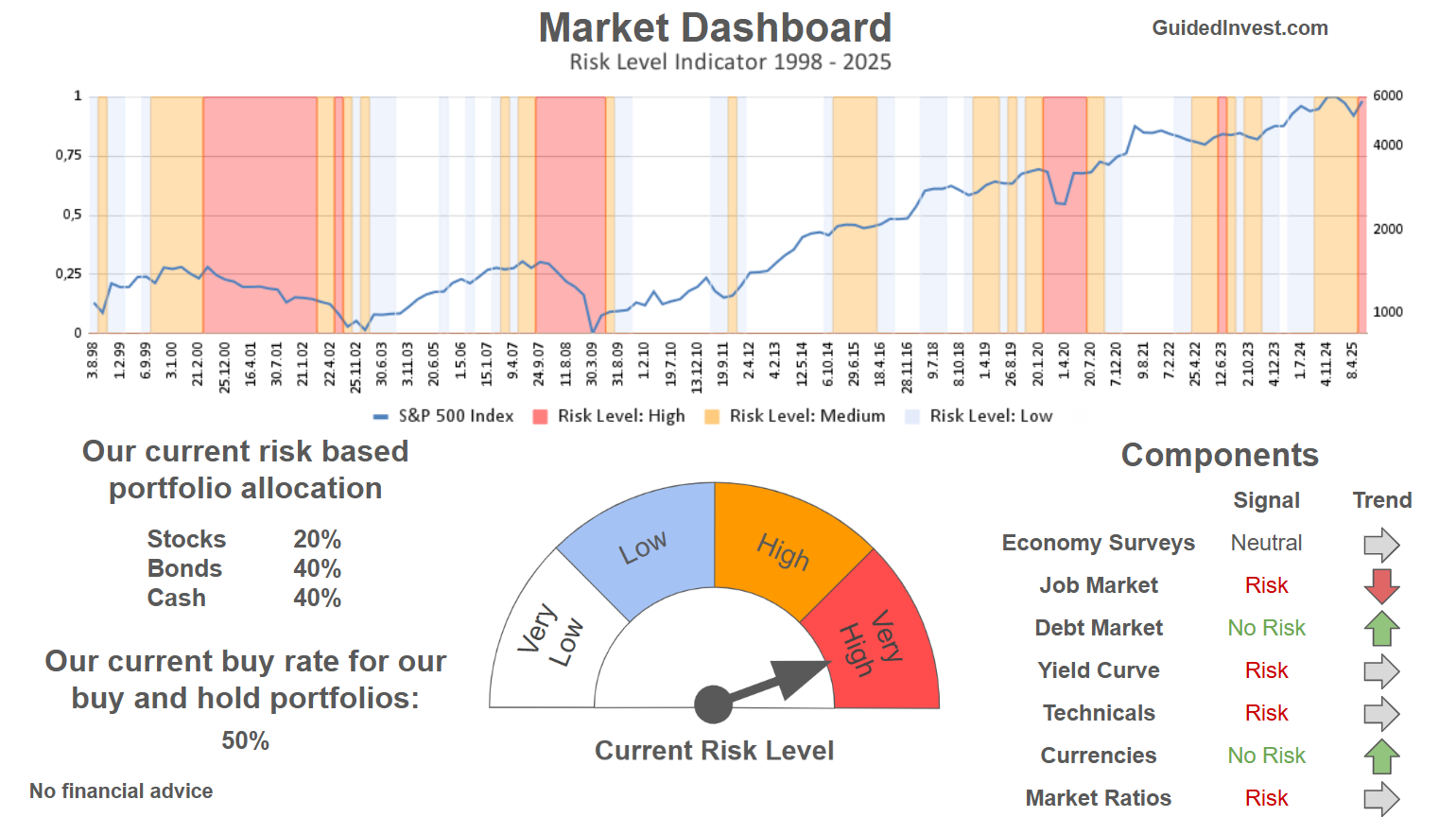
Track Market Risk with Our Dashboard
Our Market Dashboard provides a quick overview of the current market conditions and, more importantly, the associated risk. You can view a chart of one of our tools, the Risk Level Indicator, showing predicted risk from 1998 to 2025. If you are interested, you can visit our Dashboard site here.
The world of finance is complex and includes many technical terms. For explanations of these terms, I recommend using the Investopedia dictionary.
Leave a Reply