
Hello and welcome to this week’s analysis on the S&P 500. The S&P 500 had a very strong gain of 2.6% this week. Looking at the four-hour chart, we can see that last week there was a very big and sharp drop, and the market basically closed the week at the lows of that decline. We then had a very nice test of the support zone at 6,220. This week, we saw strong rebounding price action and were almost able to recover all of last week’s losses.
We tested the 6,220 area, which I have marked with a red circle. On the way up, you can also see how we tested on the lows the black trend line’s lower leg — part of a rising trend channel marked with these black trend lines. The middle zone of those black trend lines also provided resistance on the way up. This serves as a short-term guide for whether this rise in prices can continue or if we will break lower again. For that, we will watch next week’s action in this shorter-term trend channel and the black trend line in the middle of it.

On the way up, we also had a very nice retest of the 6,300 support zone — that is the second red circle on the chart. We can see that all of these support zones were in effect in one way or another.
Are you wondering when to buy the S&P 500 as an investor? Join our community of smart do-it-yourself investors who are making informed decisions with our expert insights, just by signing up with your email!
Premium Guide
Advanced Investing Signals
Basic Guide
Basic Investing
Signals
Simple Guide
Selected
Signals
Get started today with our free financial guide! Just enter your email, and you’ll start receiving our most popular Simple Guide with exclusive market signals right in your inbox.
Rebound Faces Resistance at Previous Highs
Switching to the daily chart, we can see how the S&P 500 this week was able to crawl along the green shaded area, which is the lower trend line of the upward-rising trend channel. This trend channel is marked with green, gray, and red shaded areas as trend lines, and it has been intact since April, guiding prices nicely since then.
You can also see how last week we dropped out of the gray shaded area of the trend channel in a big move straight down into the green shaded area. This week, we were able to hold this level and remain inside the trend channel, not falling out of it. We will now see how this develops — whether we get another strong rise in prices, breaking out of this lower bound area of the trend channel and moving back toward the gray shaded middle area, or if we finally break substantially to the downside.
Looking again at the daily candles, we can see the clear support zones where we found support: first at 6,220, and then with the retest of the 6,300 support during this week.
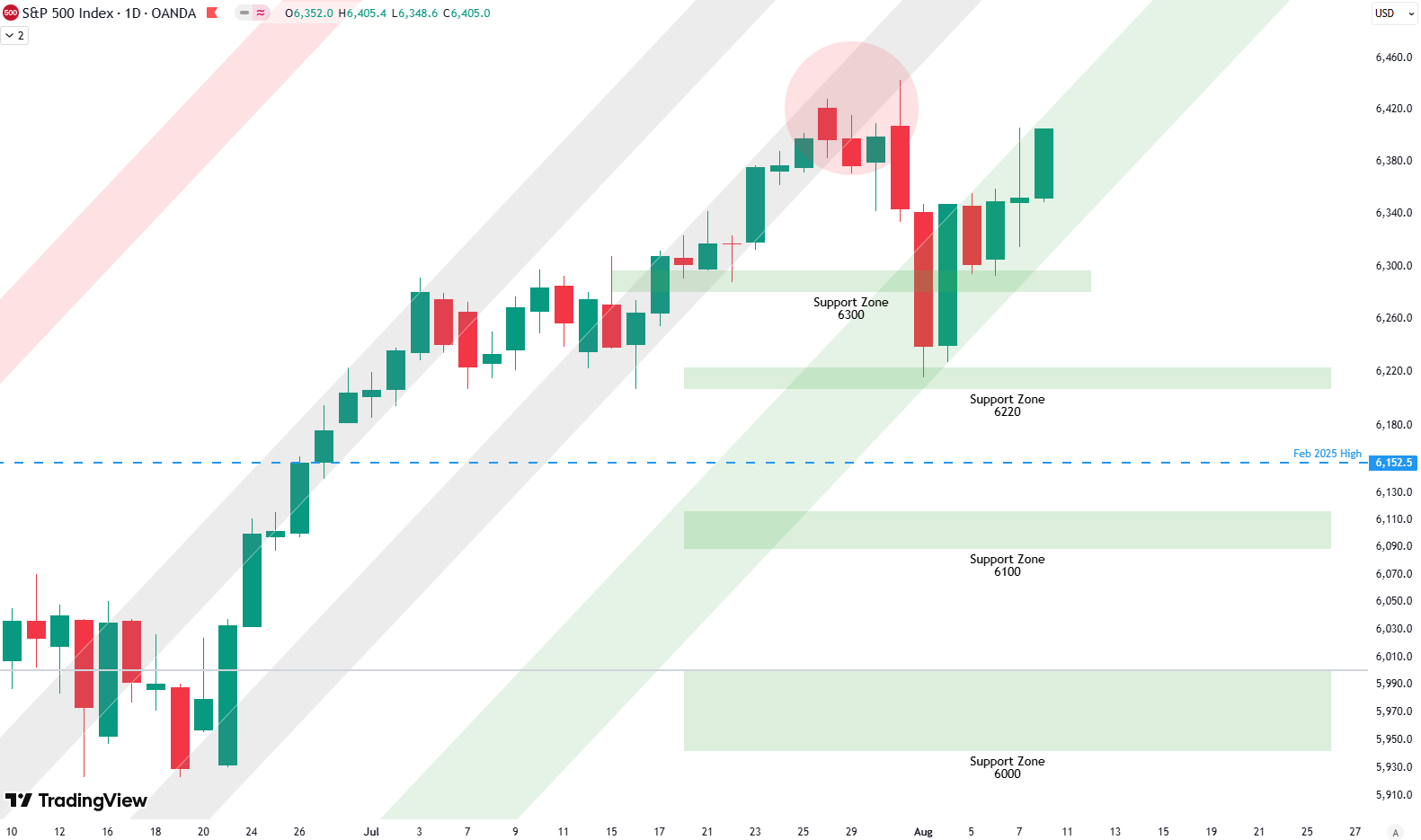
We can also see how, before last week’s drop, the S&P formed a top with several daily highs in the same area (marked with a red circle). We are now coming right into that area again, which should provide resistance at this point, so some kind of pullback can be expected.
Whether this correction is finished will become clear next week. We have also written an article this week that analyzes the weekly chart, and I would suggest you read it. That analysis provides evidence that the correction is not yet over and that prices may need to go lower. Weak seasonality in August and September would also suggest the correction is not finished. We may still make a new high, but the upside should be limited for now.
Be careful here and don’t get caught up in the up-and-down moves like we saw over the last two weeks. Volatility will likely remain, and similar swings can be expected in August and September.
For subscribers it is very important to follow our risk management measures that we provide with all our services to protect against losses in case support zones break
Stay ahead of the market! Sign up for our weekly updates and get expert insights on the S&P 500, key support levels, and market trends.
S&P 500: Seasonality Insights for 2025
So far this year, the seasonal pattern for the S&P 500 has played out pretty much as expected. The first few months brought some noticeable volatility, which lines up with what we usually see in the early part of the year. Historically, January and February tend to be choppy, and that turbulence can sometimes stretch into March — and that’s exactly what happened this year.
In April, we had a sharp correction, which doesn’t line up exactly with the seasonality pattern. However, it might have been the May or June weakness playing out early this year in April. Since April, we’ve seen a very strong rise into the summer, all the way to the end of July. That, on the other hand, aligns very well with the seasonality.

Now, of course, we are looking into August and September, which are typically weak months of the year. The setup of starting a downturn in August seems to be right on time when we look at seasonality — you can see how prices in August and September tend to have big swings up and down, with a lot of volatility. Therefore, August and September should be expected to bring some weakness.
We will keep an eye on this, and then, when we come into October, we reach the strongest phase of the year. October, November, and December typically bring the year to an end with very strong seasonality. We will see if this holds true this year as well.
Of course, this isn’t a guarantee — it’s more of a roadmap based on past patterns. Ultimately, seasonal trends provide valuable context, but they must be considered alongside current market dynamics and technical analysis for a clearer picture.
Track Market Risk with Our Dashboard
Our Market Dashboard provides a quick overview of the current market conditions and, more importantly, the associated risk. You can view a chart of one of our tools, the Risk Level Indicator, showing predicted risk from 1998 to 2025. If you are interested, you can visit our Dashboard site here.

The world of finance is complex and includes many technical terms. For explanations of these terms, I recommend using the Investopedia dictionary.
Leave a Reply