
Hello everybody. In this week’s article, we’ll take a look at silver, which has made a lot of headlines over the past few weeks because it finally broke out — following gold, which has shown strong price action over the last couple of months. Now, silver was also able to break out with a strong move to the upside.
This is a common pattern: silver often lags behind gold. We’ve seen this over the past decades — when gold moves, silver tends to follow later. And that’s exactly what has happened now. Silver surged upward.
Looking at the weekly chart, since 2020 we can draw a nicely upward-sloping trend channel. On the chart, we mark this channel with green, gray, and red shaded areas — these represent the trendlines of the rising trend channel.
- The green trendlines at the bottom act as support.
- The gray trendline in the middle acts as a balance point, serving both as resistance and support.
- The red trendline at the top represents resistance.

You can see that since 2020, the price has interacted very clearly with these trendlines. Now, in the past few weeks, silver has broken out of the range around $35, moving above that level and also breaking through the gray shaded area — signaling a clear move to the upside.
Want to know the best time to invest in Silver? Join our community of smart do-it-yourself investors who are making informed decisions with our expert insights, just by signing up with your email!
Premium Guide
Advanced Investing Signals
Basic Guide
Basic Investing
Signals
Simple Guide
Selected
Signals
Get started today with our free financial guide! Just enter your email, and you’ll start receiving our most popular Simple Guide with exclusive market signals right in your inbox.
Silver’s $35 Breakout: Support, Resistance, and What’s Next
Looking at the daily chart, we can see this price action even more clearly. Silver moved between the green and gray shaded areas from late 2024 until the brief crash in April 2025. In April, the price found support in the green shaded area and has been in a strong uptrend since then.
We can also draw a black trendline on the daily chart, starting from April, which captures the strength of the current uptrend very well.
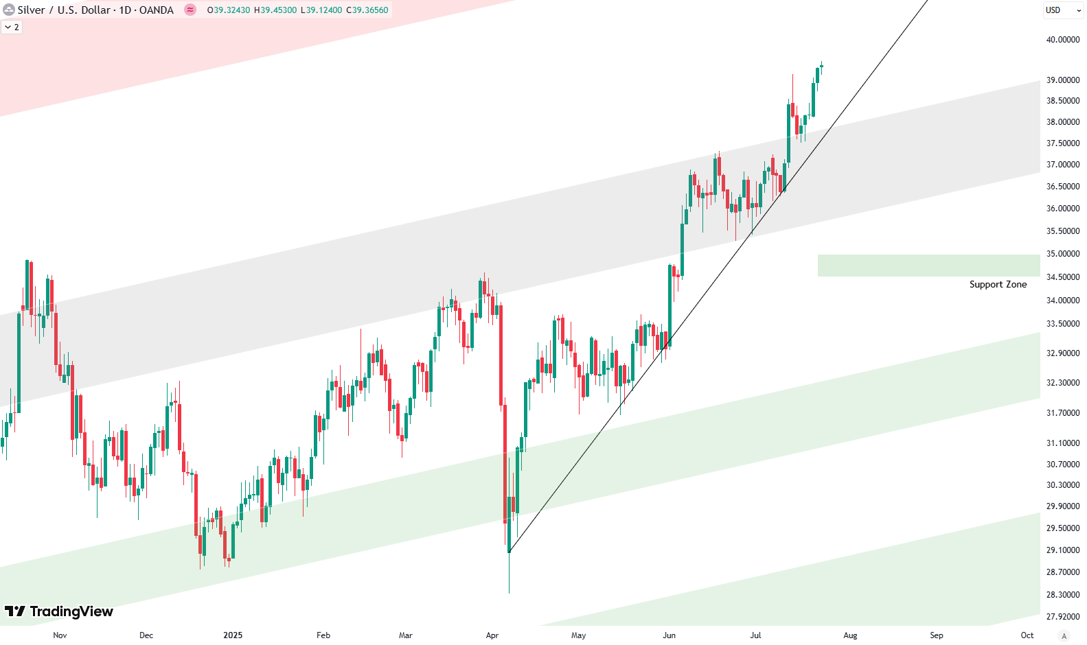
At some point, we could expect a retest of the gray shaded area. That would likely occur if silver breaks below the black trendline. If that happens, we might see prices fall back toward the gray shaded area, which would be a potential entry opportunity.
There is also a strong horizontal support zone around $35, shown on the chart as a green box. At some point, I expect this zone will be tested again. It’s an important support area that aligns with several major tops from the past. A successful retest of this zone would confirm it as solid support — and could present another interesting buying opportunity.
So far, this is the picture for silver on the weekly chart. It’s currently overbought, as the price has moved up sharply in a short time. That means a correction is somewhat expected. However, the rally could continue for a while before that happens. It’s wise to be a bit cautious now and possibly wait for a pullback into the gray shaded area before entering new positions in silver.
If you’re interested in catching more expert insights and signals like this one in the future, consider signing up with your email to get them delivered when it matters most.
The world of finance can be complex, with many technical terms. For explanations of financial terminology, try using the Investopedia dictionary.
Leave a Reply