
Welcome to our analysis of this week’s price action on the S&P 500. We begin by looking at the 4-hour chart, where we see the black trend channel that has been in place for a couple of weeks now — as discussed in several of our recent updates. Over the past few weeks, we’ve seen an extended sideways movement.
This week, the S&P 500 showed quite a bit of volatility. On Monday and Tuesday, prices moved up, followed by a sharp drop on Tuesday evening and again on Wednesday. After that, we saw strong upward movement. There was a breakout to the upside — you can see how prices moved above the previous highs on the 4-hour chart.

The black trendlines also played an important role this week. On Tuesday, we were rejected from one of the upper trendlines, and on Wednesday, we found support at the lower trendline. From there, prices bounced back up. So, these trendlines continue to act as a guide for the short-term direction.
Are you wondering when to buy the S&P 500 as an investor? Join our community of smart do-it-yourself investors who are making informed decisions with our expert insights, just by signing up with your email!
Premium Guide
Advanced Investing Signals
Basic Guide
Basic Investing
Signals
Simple Guide
Selected
Signals
Get started today with our free financial guide! Just enter your email, and you’ll start receiving our most popular Simple Guide with exclusive market signals right in your inbox.
Key Resistance Becomes Support as S&P 500 Clears 6,300
Looking at the daily chart, the sideways consolidation that’s been taking place since the start of July is clearly visible. With this week’s price action, especially on Thursday, we were able to break above the previous highs. Those highs now form a new support zone — around the 6,300-point level, which is marked in green on the chart.
We also bounced from the gray-shaded area of the larger uptrend channel that started at the April low. The sideways move brought us into the lower gray zone, which then acted as support and allowed prices to bounce.
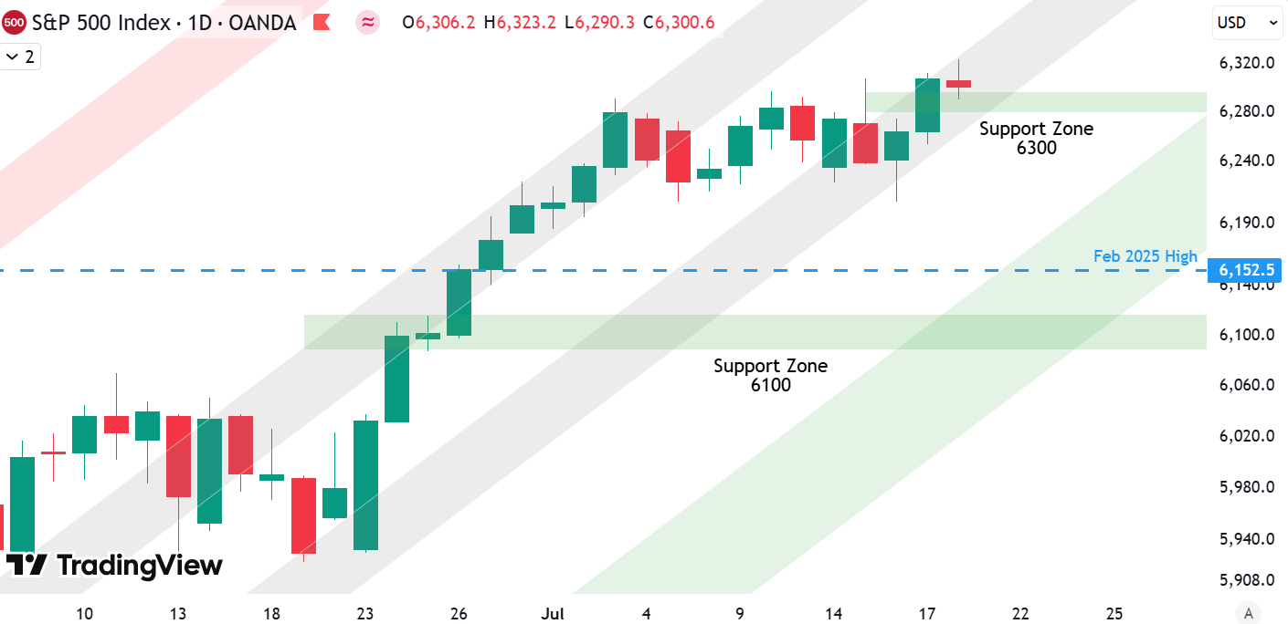
This gray-shaded area clearly provided strong support this week. Additionally, the overbought conditions we had on the daily chart have now eased somewhat, giving the market more room to the upside after this recent consolidation.
We now have a well-defined support zone just below current levels, around 6,300. Further below, there’s the old all-time high from February, marked by the blue dashed line, and below that, a strong support area around 6,100. We still expect that these lower levels may be tested at some point — but for now, prices are moving higher.
As long as this zone around 6,300 holds, the uptrend remains intact.
For subscribers it is very important to follow our risk management measures that we provide with all our services to protect against losses in case support zones break
Stay ahead of the market! Sign up for our weekly updates and get expert insights on the S&P 500, key support levels, and market trends.
S&P 500: Seasonality Insights for 2025
So far this year, the seasonal pattern for the S&P 500 has played out pretty much as expected. The first few months brought some noticeable volatility, which lines up with what we usually see in the early part of the year. Historically, January and February tend to be choppy, and that turbulence can sometimes stretch into March — and that’s exactly what happened this year.
Looking ahead, the seasonality suggests we’re heading into a stronger period as we move toward summer. Typically, markets see some gains during this stretch, though it’s normal for there to be the occasional correction or sideways move along the way. It’s not a straight line up.

If the seasonal pattern continues to hold, we might expect a bit more volatility in May, June, and again in August and October. These months often bring correction phases or market shake-ups. Of course, this isn’t a guarantee — it’s more of a roadmap based on past patterns.
Ultimately, seasonal trends provide valuable context, but they must be considered alongside current market dynamics and technical analysis for a clearer picture.
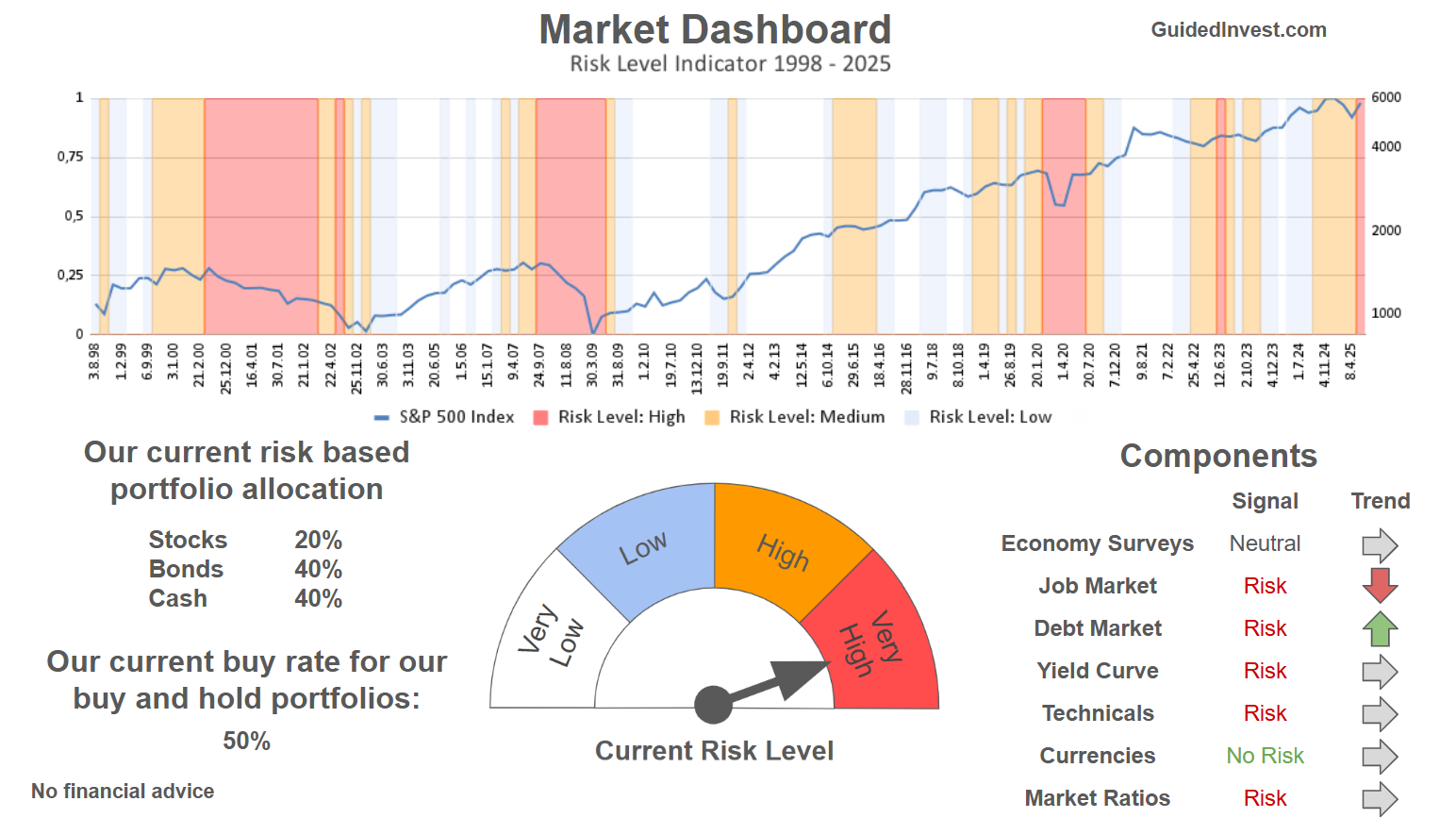
Track Market Risk with Our Dashboard
Our Market Dashboard provides a quick overview of the current market conditions and, more importantly, the associated risk. You can view a chart of one of our tools, the Risk Level Indicator, showing predicted risk from 1998 to 2025. If you are interested, you can visit our Dashboard site here.
The world of finance is complex and includes many technical terms. For explanations of these terms, I recommend using the Investopedia dictionary.
Leave a Reply