
Welcome to our weekly newsletter on the S&P 500. This was quite a week — the S&P 500 posted a very strong gain of 3.3%.
Looking at the 4-hour chart, we can see the support zone around the 6,000-point area, where the index had hovered for the last couple of weeks. Last week, we managed to push above this level and successfully retested it.
This week, we saw a strong upward move beginning Monday evening, which continued through the following days — clearly visible on the chart as steadily rising prices into Friday. Later on Friday, we experienced a bit of pushback, visible on the last red candle in the 4-hour chart.

We can now draw a short-term trend channel using the black trend lines. On Friday, prices hit the top of this channel and were slightly rejected, as marked by the red circle on the chart.
We now also have a new support zone just below — essentially the previous all-time high — which should act as a buffer if prices pull back. After such a strong rally, it’s natural to expect some consolidation or a minor correction. It’s possible we see a retracement toward the middle of the short-term rising trend channel, which coincides with the 6,100-point support zone. This confluence of support areas is marked by the second red circle on the chart — potentially a logical area for prices to find support if a pullback occurs.
Are you wondering when to buy the S&P 500 as an investor? Join our community of smart do-it-yourself investors who are making informed decisions with our expert insights, just by signing up with your email!
Premium Guide
Advanced Investing Signals
Basic Guide
Basic Investing
Signals
Simple Guide
Selected
Signals
Get started today with our free financial guide! Just enter your email, and you’ll start receiving our most popular Simple Guide with exclusive market signals right in your inbox.
Key Technical Levels in Focus After Weekly Rally
Switching over to the daily chart, we’ve redrawn the upward rising trend channel that started from the April low. This is now illustrated with green, gray, and red shaded areas, which represent the different sections of the trend channel. The red shaded area at the top has acted as resistance, while the gray middle section has provided support multiple times in recent weeks. The green shaded area marks the lower bound of the channel, which hasn’t been tested yet.
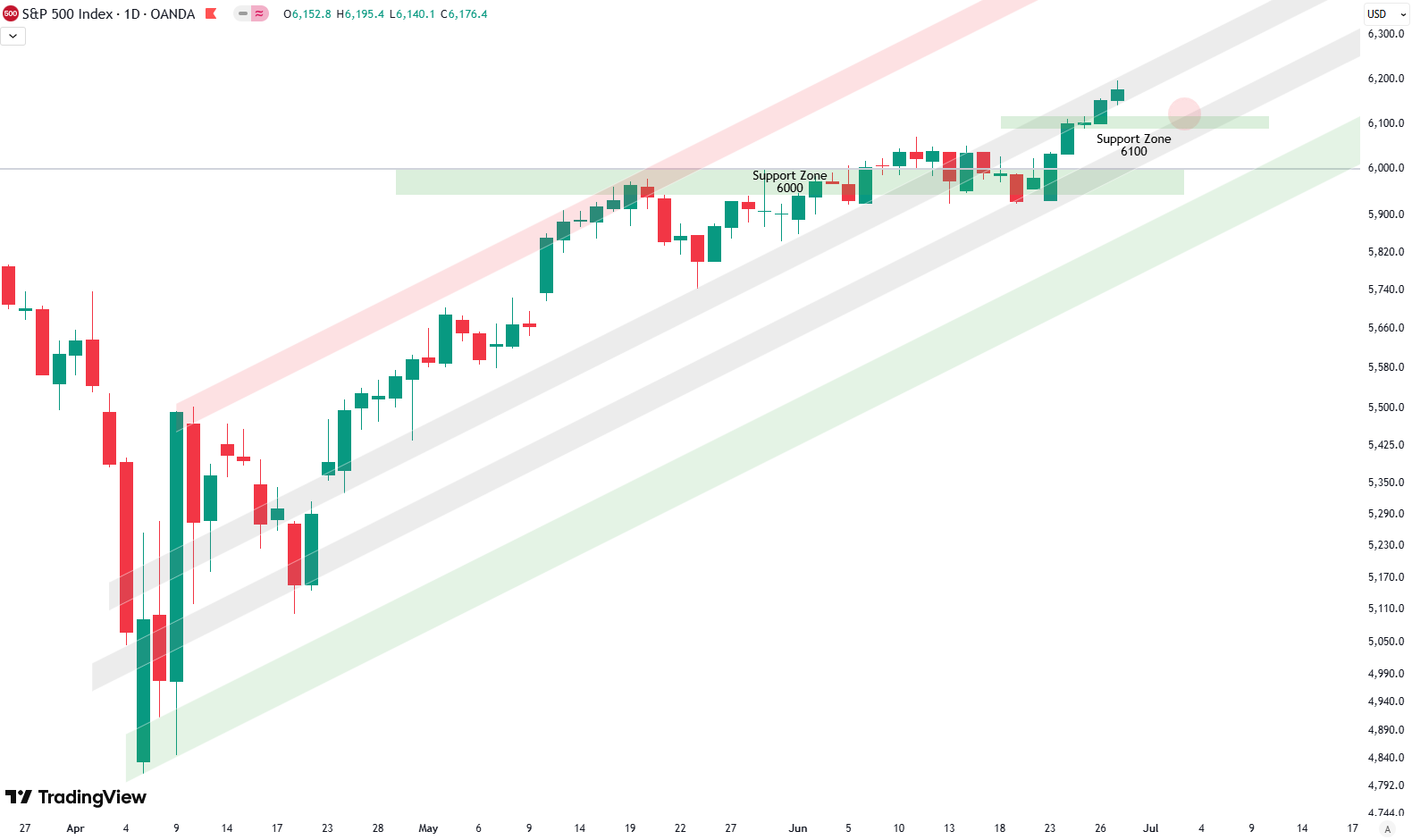
You can also clearly see the two main support zones near the 6,000 and 6,100-point level. Currently, prices are trading in the upper gray zone of the channel, which typically indicates resistance. That suggests a short-term pullback may be coming. The same red circle we highlighted on the 4-hour chart is visible here on the daily chart as well. It marks the potential area where prices might test the 6,100 support zone again. If that happens, it’s possible the market pulls back into the lower gray shaded area in the middle of the channel.
This setup creates a cluster of strong technical support zones — a logical area where prices may consolidate before deciding on the next move. After such a strong upward rally, a pause or a short-term correction is not only possible but expected. Markets don’t move in straight lines, and some cooling off here would be normal and even healthy for the trend.
Let’s see how the price action develops from here over the coming days.
For subscribers it is very important to follow our risk management measures that we provide with all our services to protect against losses in case support zones break
Stay ahead of the market! Sign up for our weekly updates and get expert insights on the S&P 500, key support levels, and market trends.
S&P 500: Seasonality Insights for 2025
So far this year, the seasonal pattern for the S&P 500 has played out pretty much as expected. The first few months brought some noticeable volatility, which lines up with what we usually see in the early part of the year. Historically, January and February tend to be choppy, and that turbulence can sometimes stretch into March — and that’s exactly what happened this year.
Looking ahead, the seasonality suggests we’re heading into a stronger period as we move toward summer. Typically, markets see some gains during this stretch, though it’s normal for there to be the occasional correction or sideways move along the way. It’s not a straight line up.

If the seasonal pattern continues to hold, we might expect a bit more volatility in May, June, and again in August and October. These months often bring correction phases or market shake-ups. Of course, this isn’t a guarantee — it’s more of a roadmap based on past patterns.
Ultimately, seasonal trends provide valuable context, but they must be considered alongside current market dynamics and technical analysis for a clearer picture.
Track Market Risk with Our Dashboard
Our Market Dashboard provides a quick overview of the current market conditions and, more importantly, the associated risk. You can view a chart of one of our tools, the Risk Level Indicator, showing predicted risk from 1998 to 2025. If you are interested, you can visit our Dashboard site here.

The world of finance is complex and includes many technical terms. For explanations of these terms, I recommend using the Investopedia dictionary.
Leave a Reply