
Welcome to this week’s article. It was quite an interesting week on the S&P 500. The S&P 500 lost about half a percent, and when we look at the 4-hour chart, you can see how on Monday, Tuesday, and into Wednesday, prices rose steadily, but then dropped off starting late Wednesday and continued lower through the rest of the week.
Several things are happening here. First of all, we focus on the rising wedge pattern we’ve discussed over the last couple of weeks. This is formed by the green trend lines that make up the rising wedge pattern. On Wednesday, things were looking quite good, and the S&P 500 was able to break out briefly to the upside of this wedge pattern — that’s the first red circle on the chart. Then, prices fell again and moved slightly higher within the very narrow edge of this wedge pattern. Finally, on Thursday, there was a significant drop out of it. On Friday, the price came back quite a bit and retested the lower trend line of this rising wedge pattern — this is marked by the second red circle.
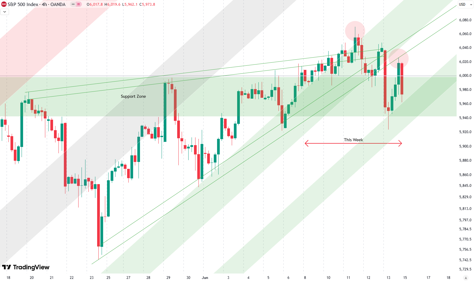
Later on Friday, the price was rejected from this level. So it’s quite interesting — first a fakeout to the upside, then a breakout to the downside. We’re still holding around the 6,000-point area, and then there’s this rejection from the green trend line of the wedge. Quite interesting — we’ll see how that develops next week.
Are you wondering when to buy the S&P 500 as an investor? Join our community of smart do-it-yourself investors who are making informed decisions with our expert insights, just by signing up with your email!
Premium Guide
Advanced Investing Signals
Basic Guide
Basic Investing
Signals
Simple Guide
Selected
Signals
Get started today with our free financial guide! Just enter your email, and you’ll start receiving our most popular Simple Guide with exclusive market signals right in your inbox.
Key Support Around 6,000 Holds — For Now
Now, when we look at the daily chart, things may get a little less confusing. Here, we see the price of the S&P 500 going back to the end of April. Since then, there has been a very strong uptrend, and we can draw a upward-sloping trend channel — something we’ve also discussed over the last couple of weeks in the analysis.
We’ve now added a second green trend line to this channel. The green shaded areas represent support levels formed by trend lines, while the red shaded area on the top acts as resistance, and the gray area represents more of a balance point. The new green shaded area has been added to the very bottom of this rising trend channel — we didn’t have that last week. It actually connects to the very low of April and also aligns with this week’s price action, where we retested this lower green shaded support zone. That’s also marked with a red circle on the chart.
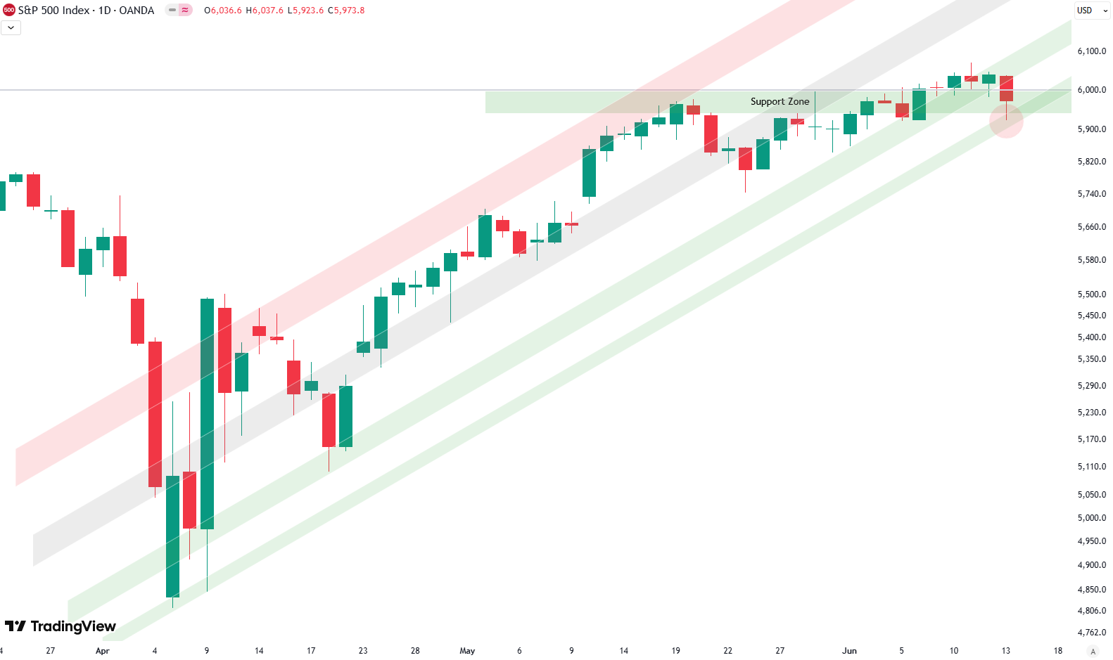
The index still trades around the 6,000-point area which is very significant — something we’ve discussed for weeks. I’ve now flipped this level into a green support zone, marked as a green box on the chart. We’re still holding it — just barely. We haven’t been able to push above it decisively, but throughout the week we traded above this zone. Only on Friday did we dip slightly into it — not below it, just into the zone. So the support is still valid, especially with that nice wick on Friday, which also is marked with the red circle — testing the zone nicely before pushing out of it slightly.
Of course, it’s crucial to see how things unfold over the next couple of trading days. If prices drop out of this zone, that would also mean breaking down from the rising trend channel. As we saw on the 4-hour chart, the wedge pattern was broken to the downside, so maybe that’s a bit of a bearish signal on the smaller time frames. But when we look at the daily chart, everything still looks fine for now.
We’ll see how this develops — it’s definitely a pretty interesting and potentially pivotal point for the S&P 500 heading into next week.
For subscribers it is very important to follow our risk management measures that we provide with all our services to protect against losses in case support zones break
Stay ahead of the market! Sign up for our weekly updates and get expert insights on the S&P 500, key support levels, and market trends.
S&P 500: Seasonality Insights for 2025
So far this year, the seasonal pattern for the S&P 500 has played out pretty much as expected. The first few months brought some noticeable volatility, which lines up with what we usually see in the early part of the year. Historically, January and February tend to be choppy, and that turbulence can sometimes stretch into March — and that’s exactly what happened this year.
Looking ahead, the seasonality suggests we’re heading into a stronger period as we move toward summer. Typically, markets see some gains during this stretch, though it’s normal for there to be the occasional correction or sideways move along the way. It’s not a straight line up.

If the seasonal pattern continues to hold, we might expect a bit more volatility in May, June, and again in August and October. These months often bring correction phases or market shake-ups. Of course, this isn’t a guarantee — it’s more of a roadmap based on past patterns.
Ultimately, seasonal trends provide valuable context, but they must be considered alongside current market dynamics and technical analysis for a clearer picture.
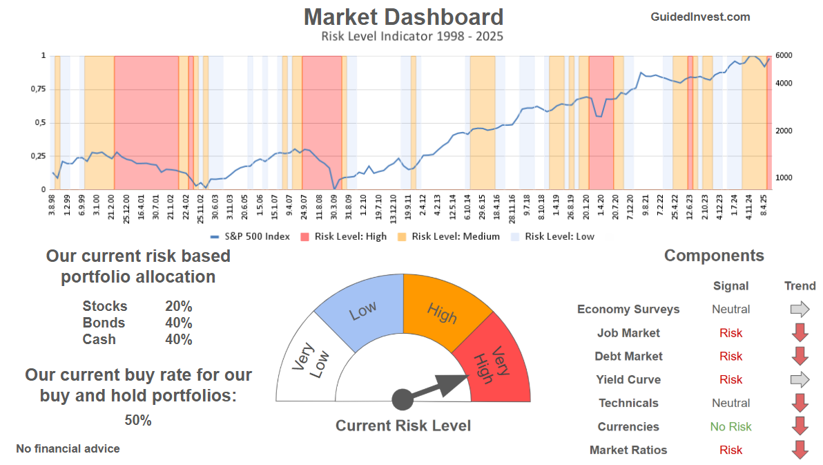
Track Market Risk with Our Dashboard
Our Market Dashboard provides a quick overview of the current market conditions and, more importantly, the associated risk. You can view a chart of one of our tools, the Risk Level Indicator, showing predicted risk from 1998 to 2025. If you are interested, you can visit our Dashboard site here.
The world of finance is complex and includes many technical terms. For explanations of these terms, I recommend using the Investopedia dictionary.
Leave a Reply