
Hello everybody, this week we’ll take a look at Apple. We’re looking at the monthly chart, which goes quite a way back — all the way to the year 1999 — so we’ve got a solid 25 years of price data here.
We can draw a very nice and clean upward trend channel, using green, grey, and red shaded areas as trend lines. The red trend line has acted as resistance multiple times over this time span, while the green shaded area has provided support.
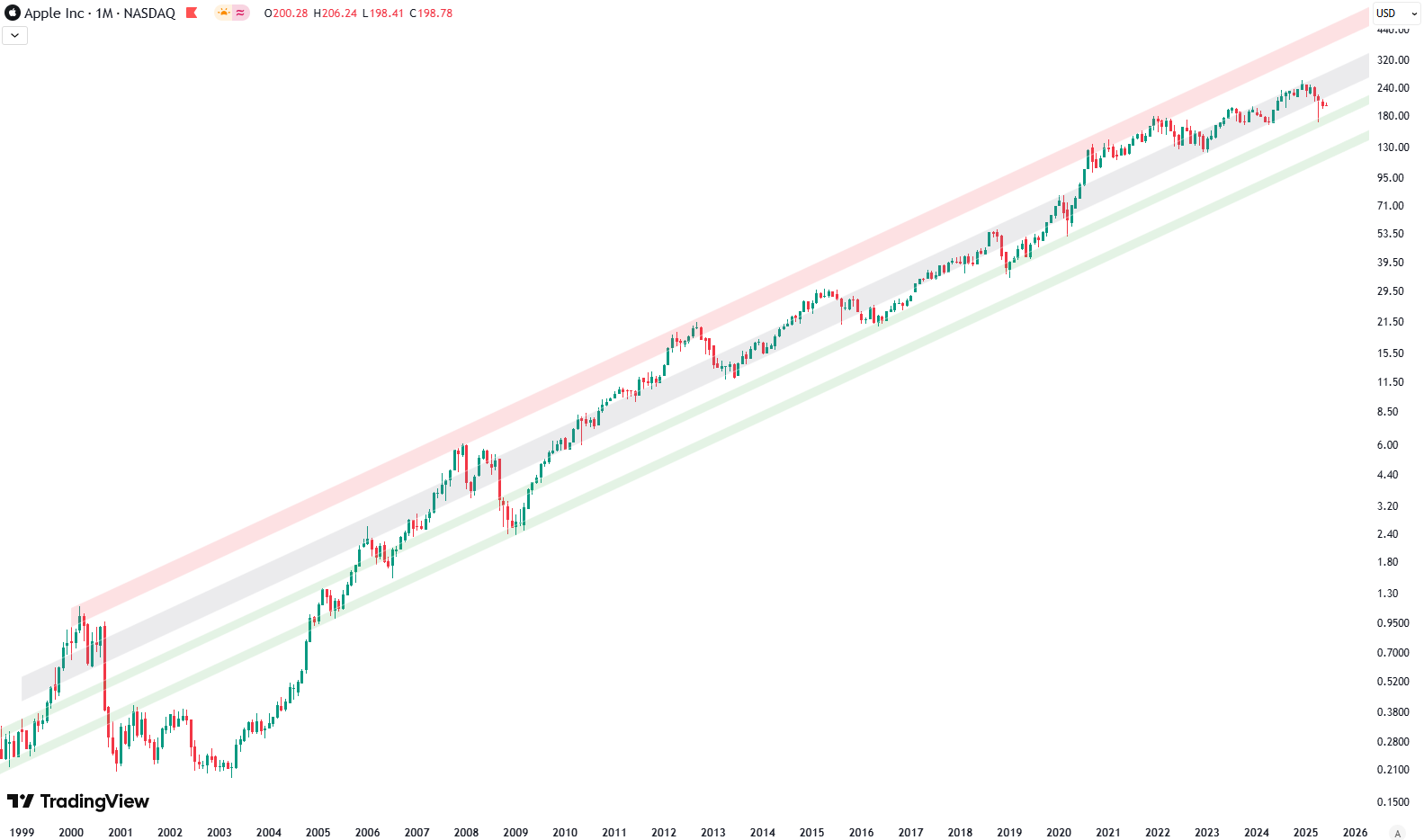
There are two green shaded areas. One has been tested multiple times, most recently with the current low in April — that’s last month. The other green trend line is a bit lower. That one was last tested in 2009, after the financial crisis. So we’re not sure yet which one will hold up — we’ll have to see how that develops.
Want to know the best time to invest in Apple? Join our community of smart do-it-yourself investors who are making informed decisions with our expert insights, just by signing up with your email!
Premium Guide
Advanced Investing Signals
Basic Guide
Basic Investing
Signals
Simple Guide
Selected
Signals
Get started today with our free financial guide! Just enter your email, and you’ll start receiving our most popular Simple Guide with exclusive market signals right in your inbox.
Is a Breakdown Coming? Apple at the Edge of Support
Now, when we switch to the weekly chart, things get really interesting. Here, I’ve disabled the grey shaded area from the large trend channel we just looked at, to make things clearer. On the weekly chart, we can draw another shorter-term trend channel, starting from early 2023. Just like the longer one, this channel also has green, grey, and red shaded areas. Again, the red line serves as resistance and the green line as support.
This shorter-term channel has held up well during the entire upward move in prices since 2023. However, when markets recently dropped sharply — and stock prices fell across the board — Apple also saw a significant decline. On the chart, you can see how Apple pierced through the green shaded area of this shorter-term trend and tested the green shaded area of the longer-term trend. I’ve marked this point on the chart with red circles.
After that test, there was a bounce, but unlike the S&P 500 — which rallied very strongly off the April low and is now almost back at all-time highs — Apple’s performance has been weaker. It did rise, yes, but it’s been moving mostly sideways over the past few weeks.
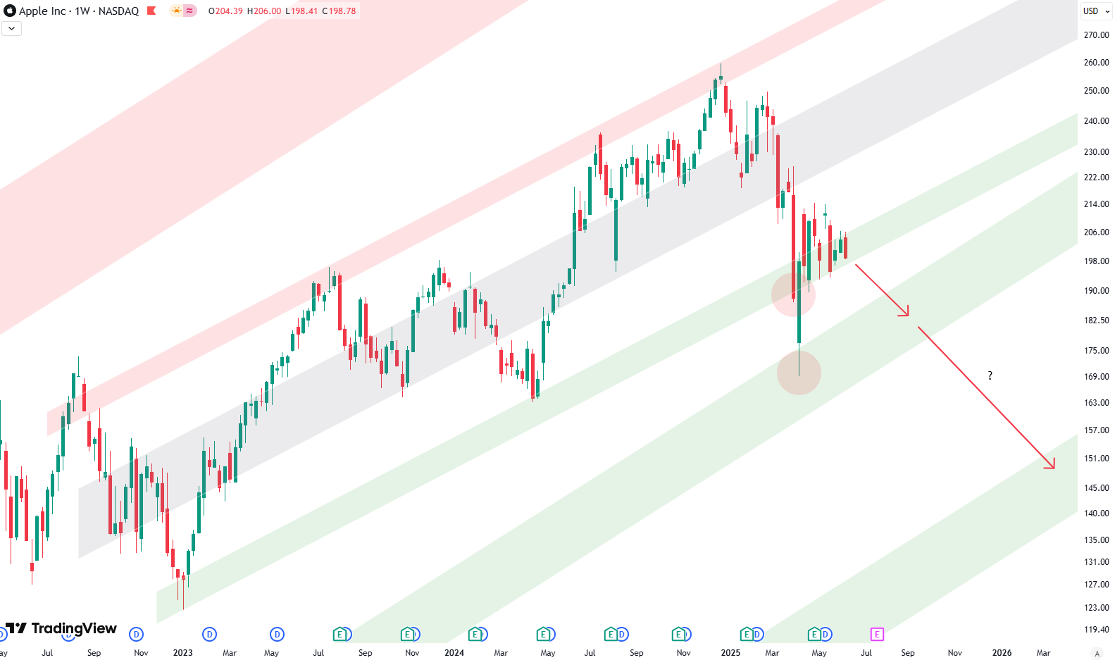
Right now, Apple is hovering right along the green trend line of the shorter-term channel. It’s really on the cusp of breaking below it, which is concerning. Because remember, while the S&P 500 is strong, if we now expect a correction in the S&P 500, then we can also reasonably expect Apple to break this green trend line. That could lead to another test of the green trend line from the longer-term channel. I’ve marked this scenario with a red arrow on the chart.
There’s also the possibility that Apple could make new lows, below the April low — we’ll have to see how that plays out. It’s definitely not looking great at the moment.
The key question is: if Apple does go back to retest the green shaded area of the longer-term trend channel (where the arrow points on the chart), can it hold? Will it hold that support, or will it break even further below, which is what the second red arrow suggests? That’s just a possibility, but one we should be aware of.
This is something that could unfold over several weeks or even months, so we’ll have to keep watching to see how it develops.
If you’re interested in catching more expert insights and signals like this one in the future, consider signing up with your email to get them delivered when it matters most.
The world of finance can be complex, with many technical terms. For explanations of financial terminology, try using the Investopedia dictionary.
Leave a Reply