
Hello everybody. So this week, the S&P 500 took a bit of a breather and had a loss of 2,7%. We saw slight gains on Monday, but then weakness from Tuesday through Thursday led into a correction phase. On Thursday we tested our support zone briefly, and on Friday the index dipped below it before snapping back to close right in that green “support zone” box.

As you can see on the 4‑hour chart, the prior uptrend channel—outlined by parallel green lines—broke down on Wednesday. After a brief bounce, price fell cleanly through the lower channel line, which I’ve circled in red. That breakdown and retest turned the channel line into resistance. Friday’s recovery back into the green support box suggests buyers are defending the level for now, but the market remains on edge until it can prove otherwise.
Are you wondering when to buy the S&P 500 as an investor? Join our community of smart do-it-yourself investors who are making informed decisions with our expert insights, just by signing up with your email!
Premium Guide
Advanced Investing Signals
Basic Guide
Basic Investing
Signals
Simple Guide
Selected
Signals
Get started today with our free financial guide! Just enter your email, and you’ll start receiving our most popular Simple Guide with exclusive market signals right in your inbox.
Overbought Conditions Ease
On the daily chart, this week’s pullback takes on more meaning. Since the April bottom, we’ve enjoyed a solid rally straight into our red “resistance zone.” At that level, the market was deeply overbought and primed for a pause—which is exactly what we saw.
This correction from the resistance zone was healthy. It has helped unwind some of those overbought readings and reset momentum. Now, price sits at the first green “support zone” on the chart. It briefly tested that area on Thursday, then dipped below it on Friday before bouncing back into the zone to close the week.
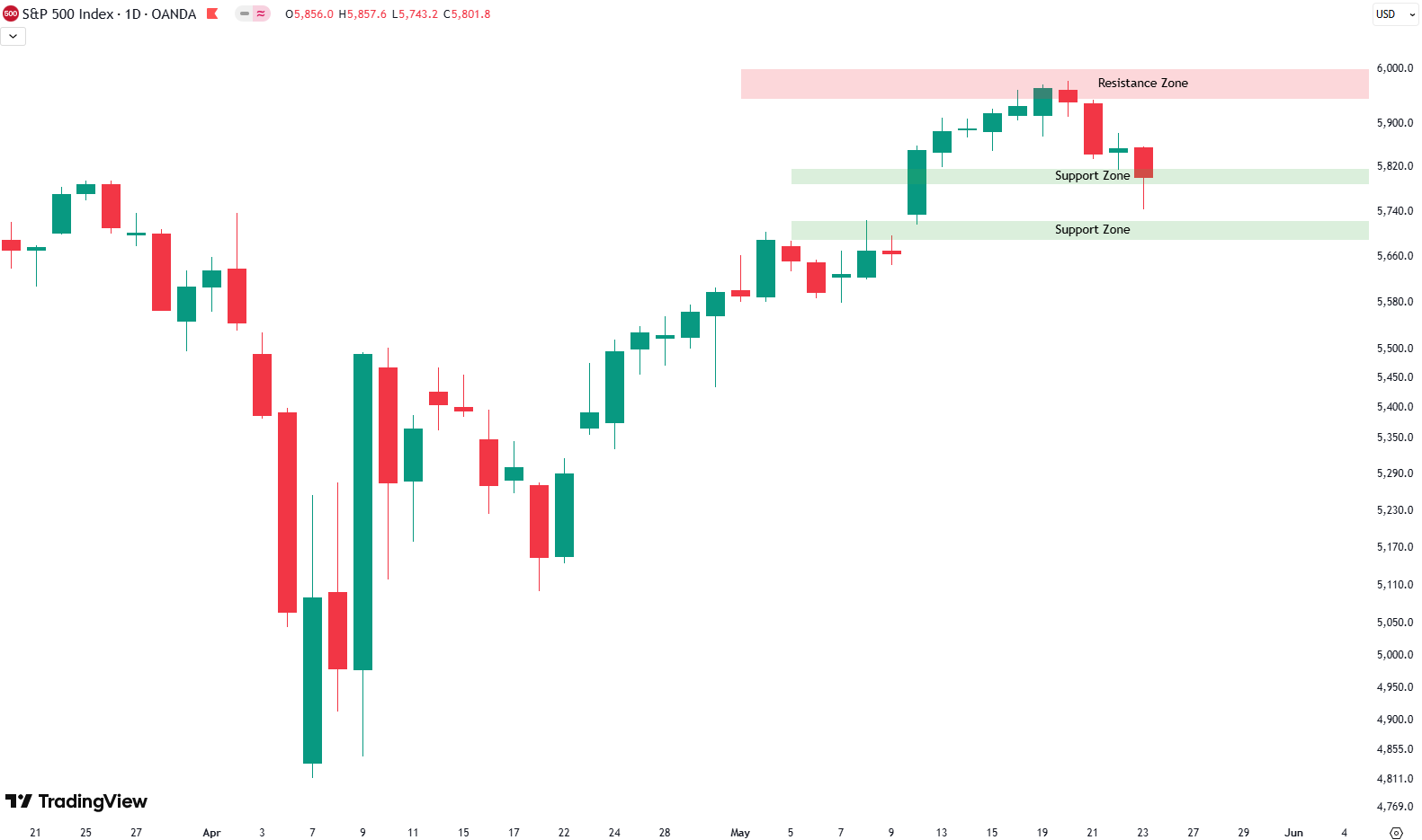
Just beneath this level lies a second support zone, also highlighted in green. If the market needs to dig deeper, that lower box is the next likely landing spot. Corrections often extend after strong rallies, so a move down to the second zone wouldn’t be unexpected.
That said, there’s no sign of a fresh downtrend or new lows yet. Right now, this looks like a routine pullback that may last a few more days—possibly into next week. Assuming these support zones hold, the uptrend should resume once the market has cleared these overbought conditions. We’ll continue watching closely to see how the S&P 500 behaves around these key levels.
For subscribers it is very important to follow our risk management measures that we provide with all our services to protect against losses in case support zones break
Stay ahead of the market! Sign up for our weekly updates and get expert insights on the S&P 500, key support levels, and market trends.
S&P 500: Seasonality Insights for 2025
So far this year, the seasonal pattern for the S&P 500 has played out pretty much as expected. The first few months brought some noticeable volatility, which lines up with what we usually see in the early part of the year. Historically, January and February tend to be choppy, and that turbulence can sometimes stretch into March — and that’s exactly what happened this year.
Looking ahead, the seasonality suggests we’re heading into a stronger period as we move toward summer. Typically, markets see some gains during this stretch, though it’s normal for there to be the occasional correction or sideways move along the way. It’s not a straight line up.

If the seasonal pattern continues to hold, we might expect a bit more volatility in May, June, and again in August and October. These months often bring correction phases or market shake-ups. Of course, this isn’t a guarantee — it’s more of a roadmap based on past patterns.
Ultimately, seasonal trends provide valuable context, but they must be considered alongside current market dynamics and technical analysis for a clearer picture.
Track Market Risk with Our Dashboard
Our Market Dashboard provides a quick overview of the current market conditions and, more importantly, the associated risk. You can view a chart of one of our tools, the Risk Level Indicator, showing predicted risk from 1998 to 2025. If you are interested, you can visit our Dashboard site here.

The world of finance is complex and includes many technical terms. For explanations of these terms, I recommend using the Investopedia dictionary.
Leave a Reply