
This week, we’re revisiting Microsoft with a fresh look at both the weekly and daily charts. For context, we first published this chart setup back in March. It’s the same long-term view that stretches all the way back to 2020—nothing changed structurally, just updated with current price action.
This trend structure dates back to 2020. In the March article, we highlighted a red circle on the chart, anticipating that Microsoft’s price might decline toward the gray trend line.
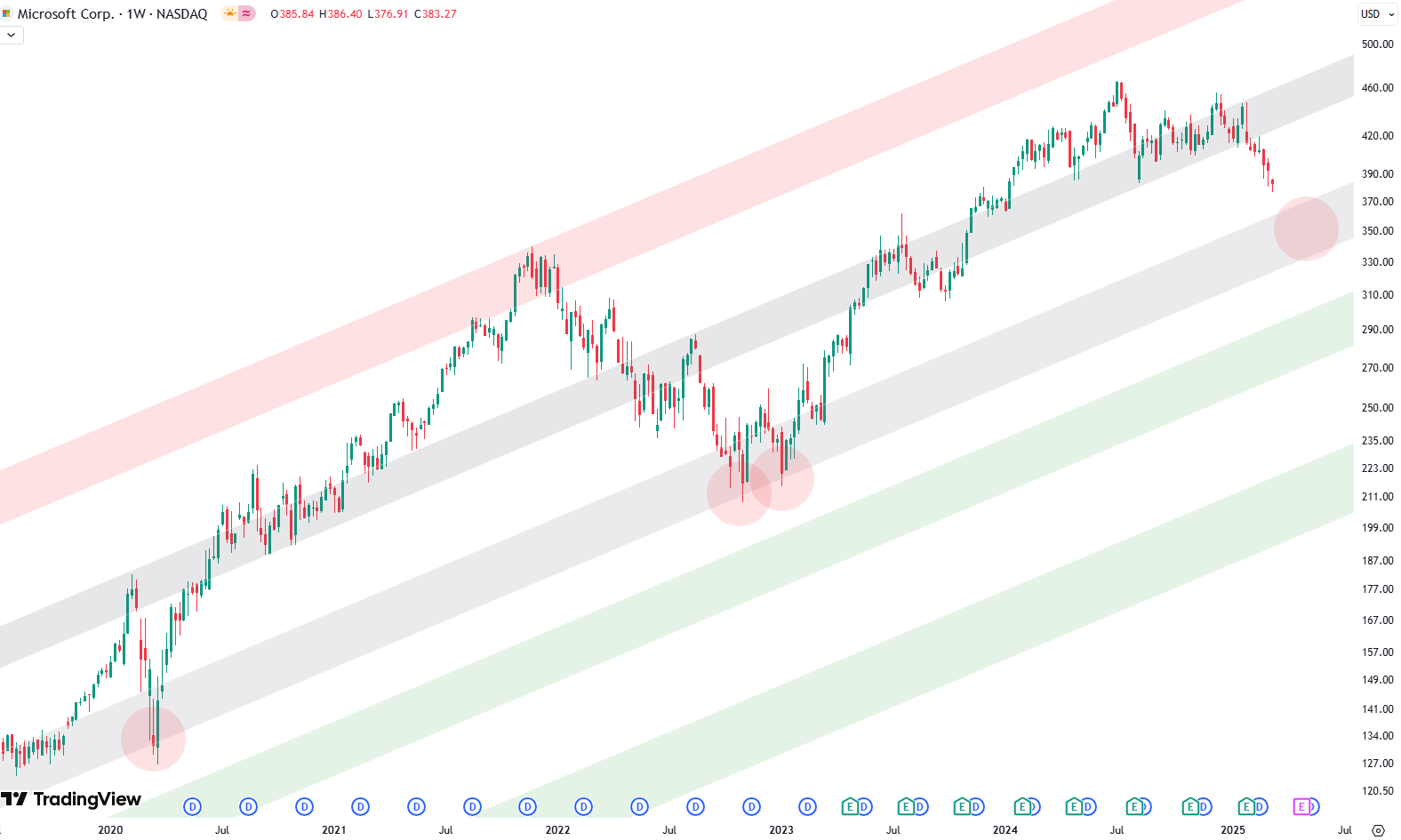
On the weekly chart, you’ll see a set of trend channels marked by colored zones: green, gray, and red. These zones aren’t just for decoration—they’ve consistently acted as support and resistance over the years. The gray zone right in the middle of the channel is often where price pauses or pivots.
Want to know the best time to invest in Microsoft? Join our community of smart do-it-yourself investors who are making informed decisions with our expert insights, just by signing up with your email!
Premium Guide
Advanced Investing Signals
Basic Guide
Basic Investing
Signals
Simple Guide
Selected
Signals
Get started today with our free financial guide! Just enter your email, and you’ll start receiving our most popular Simple Guide with exclusive market signals right in your inbox.
Weekly Chart: The Support Call That Played Out
Back in March, we placed a red circle on the chart, highlighting where we expected Microsoft might drop to retest the middle gray zone. And that’s exactly what happened. Price touched that level, respected it beautifully, and then bounced hard. The move was clean, and powerful. A textbook support zone bounce.
That zone turned out to be a great place for investors to add exposure. We flagged it as a possible buying opportunity at the time, and it definitely delivered.
Fast forward to today: Microsoft didn’t just bounce. It kept climbing and now finds itself sitting right in the upper gray shaded zone—a key resistance area.
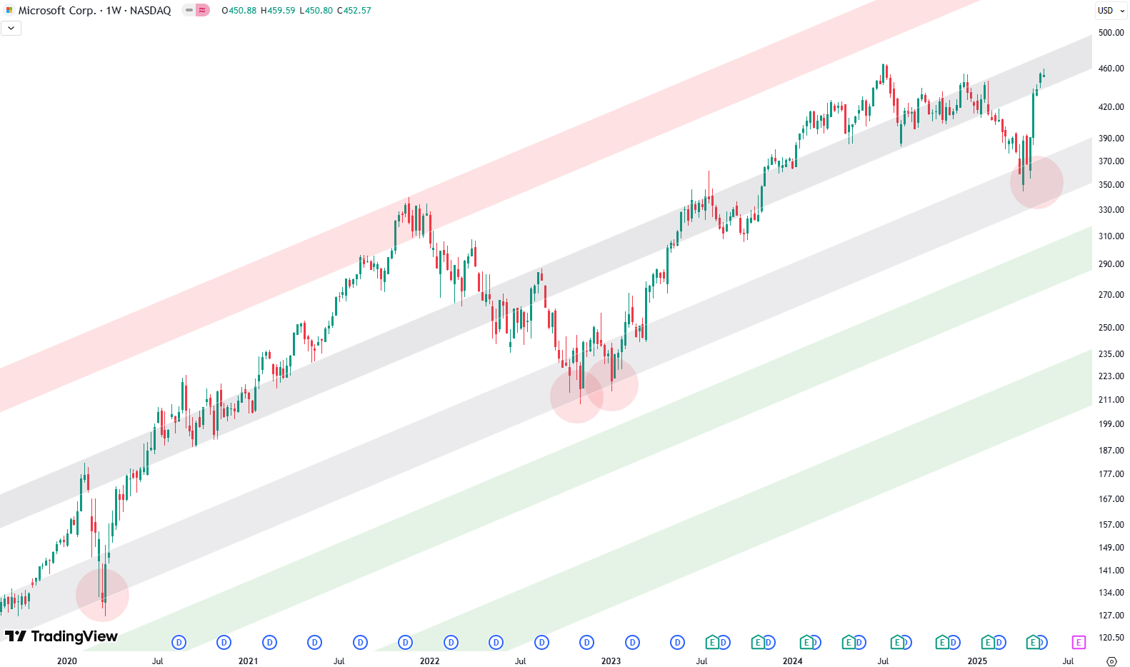
Daily Chart: Zooming In on the Recent Rally
If you switch over to the daily chart, it gives you a more zoomed-in view of how this has unfolded. Price dropped into April, bottomed out right in that lower gray area again, and then took off alongside a strong move in the broader market. The S&P 500 rallied as well, but Microsoft actually looked even stronger. It was one of the names really leading that bounce.
Now though, things are heating up again—but not necessarily in a good way. We’re back at the upper gray resistance zone, and on top of that, there’s a horizontal resistance band marked by a red box. This confluence of resistance levels makes the current setup pretty interesting.
If you’ve been holding MSFT through this move, it might be a good moment to think about trimming back a bit. Not an all-out exit—just some light profit-taking. Reducing your exposure back to your target weight is often a smart play in these kinds of overbought zones.

There’s also a green support box below. If price does pull back, that’s the zone we’ll be watching. It’s not guaranteed to hit, but if it does, it could once again be a good area for anyone looking to get back in or add more.
One thing we’ve seen time and again is that these kinds of support and resistance setups offer cleaner signals than any news headline. If you’re the type who prefers a bit more structure in your investing, this might be worth paying attention to.
So that’s where we are with Microsoft right now: from a strong bounce off support to a likely pause at resistance. Price action has been technical and well-behaved. Let’s see if that continues.
If you’re interested in catching more expert insights and signals like this one in the future, consider signing up with your email to get them delivered when it matters most.
The world of finance can be complex, with many technical terms. For explanations of financial terminology, try using the Investopedia dictionary.
Leave a Reply