
This week, I’ve been watching GDX — the VanEck Gold Miners ETF — and it’s looking pretty interesting. GDX is a popular way to get exposure to gold mining stocks, which tend to react more strongly to changes in gold prices than the metal itself.
Why? It comes down to operational leverage. Gold miners have a bunch of fixed costs — machinery, wages, mine operations. So when gold prices go up, their revenues rise but their costs don’t move much. That means more profit, and fast. But the opposite is true when prices fall. This makes miners more sensitive to gold’s movements — almost like a leveraged play on the metal itself.
Now, let’s look at what the charts are telling us.
The Big Picture: Monthly Chart
In the monthly chart of GDX, we’re going all the way back to the 2015 lows. A clear upward-sloping trend channel shows itself, defined by three shaded zones: green at the bottom (support), red at the top (resistance), and a gray area in the middle (kind of a balance zone).
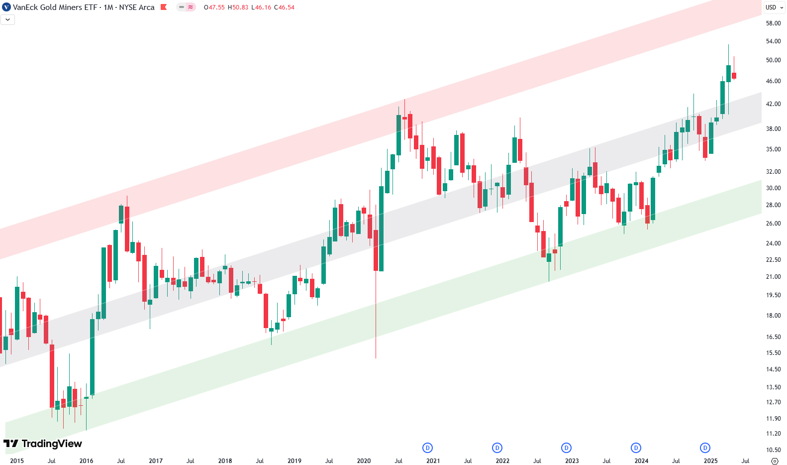
Over the past few months, GDX has shown some real strength. The price pushed through the gray middle zone — which often acts as a decision point — and we’ve now closed above it for two months in a row. That’s definitely a bullish development.
The key question now is whether GDX can continue to climb and reach the red resistance zone at the top of the trend channel. If it does, that would mean another 30% move from current levels. So there’s potentially still room to run.
Want to know the best time to invest in GDX? Join our community of smart do-it-yourself investors who are making informed decisions with our expert insights, just by signing up with your email!
Premium Guide
Advanced Investing Signals
Basic Guide
Basic Investing
Signals
Simple Guide
Selected
Signals
Get started today with our free financial guide! Just enter your email, and you’ll start receiving our most popular Simple Guide with exclusive market signals right in your inbox.
Zooming In: Daily Chart
The daily chart gives us more detail. Here too, we see an upward-sloping trend channel with the same red, green, and gray shaded areas. Recently, GDX broke out above the top of this channel — which was marked by the red shaded area.
What’s interesting now is that after this breakout, the price pulled back and is currently retesting that red zone — but this time from above. This kind of retest can often act as strong support and is generally seen as a bullish sign.

Even more compelling: this area also lines up with horizontal support, marked by a green box on the chart. That’s what traders often call a “confluence of support” — two different technical signals lining up at the same level.
So from both a long-term and short-term perspective, GDX is sitting in a spot worth watching closely.
If you’re interested in catching more expert insights and signals like this one in the future, consider signing up with your email to get them delivered when it matters most.
The world of finance can be complex, with many technical terms. For explanations of financial terminology, try using the Investopedia dictionary.
Leave a Reply