
If you’ve been tracking Alphabet (GOOG) like I have, you might be noticing something interesting — and maybe a little concerning. So, let’s break this down together, especially if you’re newer to investing. We’ll go from the big picture down to the day-to-day action. I’ll also show you what’s going on in the charts (you’ll see them below) and why it might be a warning sign not just for Google, but for the whole market.
The Big Picture: Long-Term Chart Since 2015
Let’s start with the long-term view. Looking at Google’s chart going all the way back to 2015, you can tell it’s been in a pretty solid uptrend. The chart uses a logarithmic scale — which means it adjusts for percentage changes over time — and the trend has been super clean.
There’s a clear channel structure here:
- The green shaded zones at the bottom show where the price has found strong support again and again.
- The red zone up top is where the stock tends to run into resistance — a ceiling it struggles to break through.
- And in between is the gray zone, which acts like a middle ground — sometimes support, sometimes resistance.
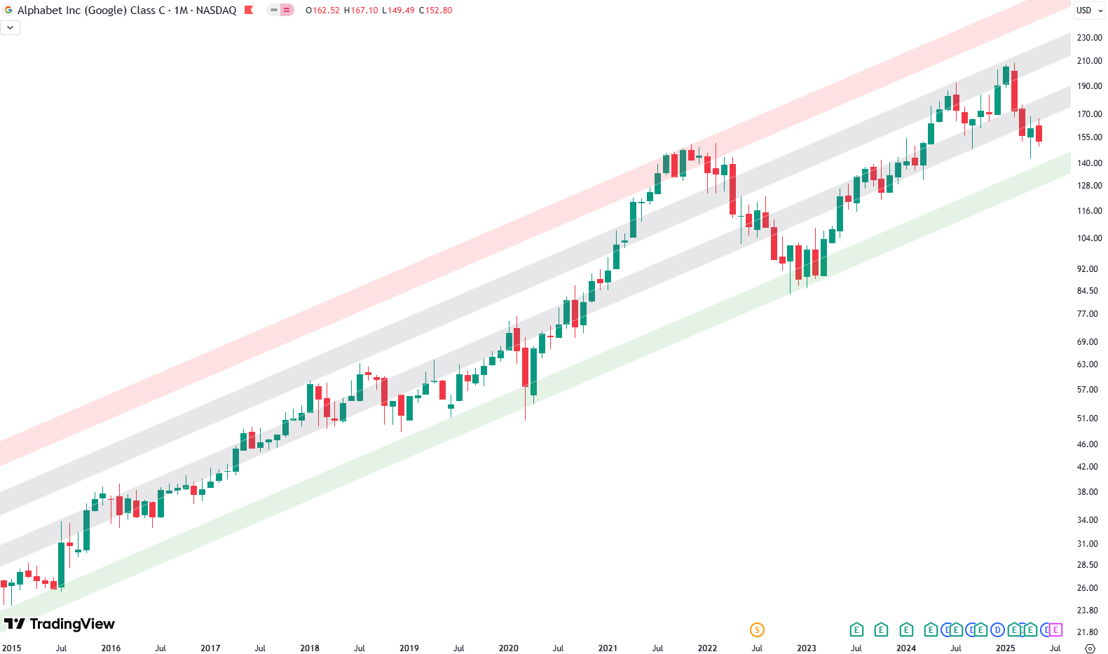
Now, take a look at the far right of the long-term chart. After a strong rally, Google bumped into the upper part of that gray area and got rejected. What followed? A sharp correction that kicked off in February — not just for Google, but across the broader market. Google’s drop wasn’t unique, but what’s important is what came after.
Now we’re seeing something different — the stock has broken below that lower gray area. That’s worth paying attention to.
Want to know the best time to invest in Google? Join our community of smart do-it-yourself investors who are making informed decisions with our expert insights, just by signing up with your email!
Premium Guide
Advanced Investing Signals
Basic Guide
Basic Investing
Signals
Simple Guide
Selected
Signals
Get started today with our free financial guide! Just enter your email, and you’ll start receiving our most popular Simple Guide with exclusive market signals right in your inbox.
Zooming In: The Weekly Chart Setup
If you move on to the weekly chart, you’ll notice how nicely Google respected that green channel after bottoming out in October 2022.
First, it bounced off the lower green zone, rallied to the upper gray area, then pulled back to the lower gray area — and repeated the move. It was like watching a ball bounce between two walls.
But then came the break. The price fell right through the lower gray zone — the one that held strong last year. That breakdown isn’t just a small hiccup; it could mean a shift in momentum.

After that drop, we did see a bit of a rebound — but it was weak. The price went back up and touched the lower gray zone from underneath, and got rejected hard. That rejection — very clean and very clear — happened just this week, and it sent the stock tumbling again.
So where could it go next? If we keep heading lower, the next spot to watch is the green support zone from the long-term chart. That zone sits somewhere around 130 to 143. If things don’t hold soon, that could be the next stop.
The Daily View: Where Things Get Really Tense
Now let’s zoom in to the daily chart. This chart gives us a closer look at the recent action.
Back in February, Google topped out again in the upper gray zone. That led to a steep drop. Then came a bounce, and the price went straight back up to the lower gray zone — but got rejected. I’ve marked that with a red circle on the chart.
This week, on May 7th, we saw another sharp move down. And this one matters because it landed exactly on a strong horizontal support area. You can trace this zone all the way back to the 2021 highs — it’s been tested several times.

This support area is shown on the chart as a slim green box labeled “support zone.” While it’s drawn narrow for clarity, it really represents a broader area. Still, this is where buyers have stepped in before. That’s why it’s such a critical level right now.
So what does all this mean?
Why It Matters Beyond Just Google
Here’s the thing — Google isn’t just another stock. It’s a mega-cap, a heavyweight that moves the market. What happens with Google can say a lot about the overall direction of the S&P 500.
Right now, while the broader market has been rallying, Google’s weakness is standing out. That’s something to watch. It might not just be a Google problem — it could be an early sign that the broader market is losing steam too.
Of course, nothing’s certain. We’re still waiting to see if this support zone will hold. But this technical setup is important to follow.
To wrap it up: Google’s in a tight spot. If it can hold this support area, maybe we bounce. But if it breaks, we could be looking at a deeper drop — possibly down to that long-term green zone. And that wouldn’t just affect Google; it might ripple across the entire market.
We’re at a turning point here, and how this plays out could shape what the next few weeks look like — not just for Alphabet, but for tech and the S&P 500 overall.
If you’re interested in catching more expert insights and signals like this one in the future, consider signing up with your email to get them delivered when it matters most.
The world of finance can be complex, with many technical terms. For explanations of financial terminology, try using the Investopedia dictionary.
Leave a Reply