
Welcome to our weekly S&P 500 update This week, the S&P 500 posted a solid gain of 2.9%.
We’re starting with the one-hour chart, where you can see how the week unfolded. Monday and Tuesday were fairly quiet, with little movement in either direction. But Wednesday brought a bit of action — a sharp drop that turned into a quick recovery. From there, the market built on those gains and pushed higher into the end of the week.
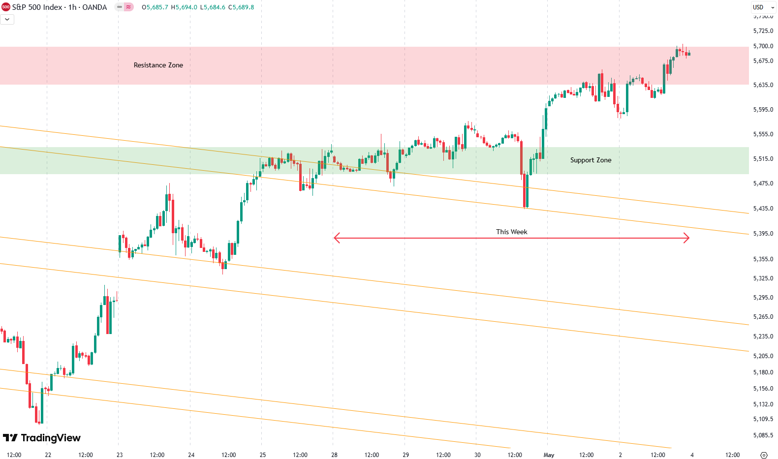
What really stood out was how cleanly Wednesday’s dip retested the downward-sloping trend channel marked by the orange trend lines. It was a textbook move — break out, come back down, touch the line, and bounce right off it. That bounce set the tone for the rest of the week.
The one-hour chart gives us a great close-up of the market’s rhythm, but to really see the bigger picture, we need to zoom out.
Are you wondering when to buy the S&P 500 as an investor? Join our community of smart do-it-yourself investors who are making informed decisions with our expert insights, just by signing up with your email!
Premium Guide
Advanced Investing Signals
Basic Guide
Basic Investing
Signals
Simple Guide
Selected
Signals
Get started today with our free financial guide! Just enter your email, and you’ll start receiving our most popular Simple Guide with exclusive market signals right in your inbox.
S&P 500 Faces Major Test
Let’s move to the daily chart.
Things are a bit clearer here. You can easily see the breakout above the downward-sloping orange trend channel that we’ve been watching for a while now. Last week, we noted that two key things needed to happen: first, a breakout above resistance, and second, that resistance holding as support.
Both happened.
On Wednesday, the S&P 500 retested that orange trend channel — marked on the chart with a red circle — and held strong. That retest, followed by a sharp move higher, also confirmed that the resistance zone had flipped to support. You’ll see that area highlighted as a green support box on the chart.

So far, so good. But now, we’re facing the next test.
The market ran into a horizontal resistance zone late in the week. You can see we had a small rejection there on Thursday, and now we’re sitting right at it again. This resistance area is a real battleground, reinforced by multiple moving averages on both the daily and weekly charts.
It’s a natural spot for the market to pause — or reverse — unless there’s enough momentum to break through. Which brings us to the broader perspective…
Now we’re looking at the weekly chart that goes all the way back to October 2022, and even further — because this upward-sloping trend channel has been in place since the 2008 financial crisis.
This long-term structure has guided the S&P 500 for nearly two decades. The green zones mark the lower boundary of the channel (support), the red zones are at the top (resistance), and the gray zone in the middle acts as a balance point — historically working as both support and resistance.
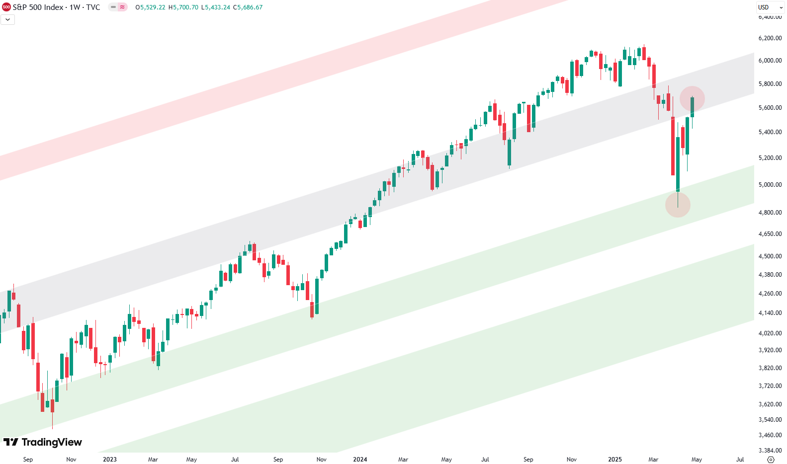
In April the market dipped hard and came down to retest the lower green support zone. It bounced strongly off that level — that bounce is shown on the chart with a red circle. That was an important signal.
Now, here’s the problem. We’re currently back at the gray mid-zone, testing it from below. There’s strong resistance here. Combine that with the horizontal resistance we talked about on the daily chart and all the stacked moving averages — this is a tough zone to break.
It doesn’t mean it can’t happen, but it’s definitely a time to be more mindful of risk.
This might be a moment to trim some positions, especially the more volatile or underperforming ones. You could even consider light hedges — short exposure to balance the risk. But if that’s not your thing, the simplest approach is to just take a little off the table and wait to see if we get a clear breakout.
If we do — above the gray resistance zone and that horizontal ceiling — you can always add back again.
For subscribers it is very important to follow our risk management measures that we provide with all our services to protect against losses in case support zones break
Stay ahead of the market! Sign up for our weekly updates and get expert insights on the S&P 500, key support levels, and market trends.
S&P 500: Seasonality Insights for 2025
So far this year, the seasonal pattern for the S&P 500 has played out pretty much as expected. The first few months brought some noticeable volatility, which lines up with what we usually see in the early part of the year. Historically, January and February tend to be choppy, and that turbulence can sometimes stretch into March — and that’s exactly what happened this year.
Looking ahead, the seasonality suggests we’re heading into a stronger period as we move toward summer. Typically, markets see some gains during this stretch, though it’s normal for there to be the occasional correction or sideways move along the way. It’s not a straight line up.

If the seasonal pattern continues to hold, we might expect a bit more volatility in May, June, and again in August and October. These months often bring correction phases or market shake-ups. Of course, this isn’t a guarantee — it’s more of a roadmap based on past patterns.
Ultimately, seasonal trends provide valuable context, but they must be considered alongside current market dynamics and technical analysis for a clearer picture.
Track Market Risk with Our Dashboard
Our Market Dashboard provides a quick overview of the current market conditions and, more importantly, the associated risk. You can view a chart of one of our tools, the Risk Level Indicator, showing predicted risk from 1998 to 2025. If you are interested, you can visit our Dashboard site here.

The world of finance is complex and includes many technical terms. For explanations of these terms, I recommend using the Investopedia dictionary.
Leave a Reply