
Welcome to our weekly newsletter on the S&P 500. This week, the S&P 500 delivered a strong gain of 4.3%. After a shaky start with losses on Monday, the market quickly turned around with powerful recoveries on Tuesday and Thursday, leading to an impressive overall performance. It was certainly a week full of momentum for the S&P 500.
Looking at the 1-hour chart, you can clearly see how this played out. The price action this week was interesting: the market managed to crawl its way up through the downward-sloping trend channel. The orange trend lines on the chart mark this channel very well.
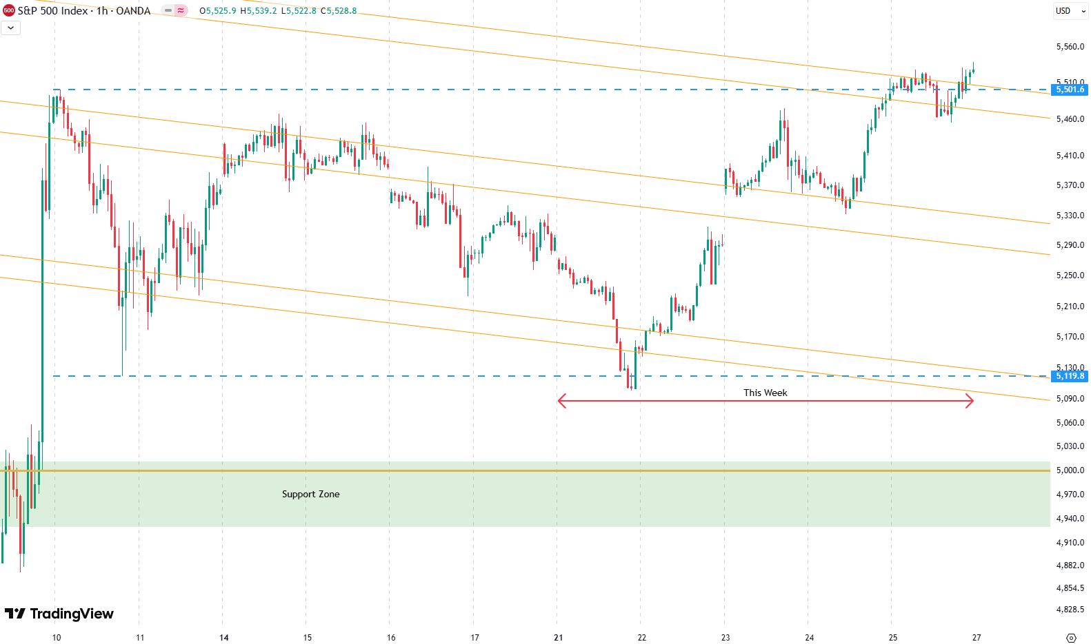
What really stands out is how the price respected those orange trend lines all week — even while rallying. The S&P 500 moved from the bottom of the channel to the top by the end of the week.
Now comes the big question: can we break out of this downward-sloping channel next week? That’s what we’ll be keeping a close eye on. Until then, it’s impressive how this steady climb unfolded after Monday’s shaky start.
Our last position, which we placed on March 17th, has been active until March 31th, when we sold it for a loss.
Are you wondering when to buy the S&P 500 as an investor? Join our community of smart do-it-yourself investors who are making informed decisions with our expert insights, just by signing up with your email!
Premium Guide
Advanced Investing Signals
Basic Guide
Basic Investing
Signals
Simple Guide
Selected
Signals
Get started today with our free financial guide! Just enter your email, and you’ll start receiving our most popular Simple Guide with exclusive market signals right in your inbox.
S&P 500 Breakout Watch
On the daily chart, the S&P 500 tested both ends of that big red candle we talked about last week. First, we touched the lower end of the candle’s range, shown by the lower blue dashed line on the chart. Prices then bounced and have now reached the upper end, marked by the upper blue dashed line.
So both sides of that trading range have been tested. The big question now is whether the S&P 500 can break out of this range to the upside in the coming days.

Also, we are sitting right at the top of the downward-sloping trend channel marked by the orange trend lines. Just a little higher, there’s a big red resistance zone waiting. It’s a strong level where the S&P 500 really needs to prove itself. A clean breakout above this zone in the coming weeks would be a strong bullish signal.
For now, there’s not much to do. Breaking out of the downward-sloping channel could offer a good opportunity, but we have to stay cautious because the resistance zone is still right in front of us.
If we do reach the resistance area over the next few days, it might be a good idea to reduce some risk. There’s always a decent chance the market could turn lower again from that strong resistance point.
For subscribers it is very important to follow our risk management measures that we provide with all our services to protect against losses in case support zones break
Stay ahead of the market! Sign up for our weekly updates and get expert insights on the S&P 500, key support levels, and market trends.
S&P 500: Seasonality Insights for 2025
So far this year, the seasonal pattern for the S&P 500 has played out pretty much as expected. The first few months brought some noticeable volatility, which lines up with what we usually see in the early part of the year. Historically, January and February tend to be choppy, and that turbulence can sometimes stretch into March — and that’s exactly what happened this year.
Looking ahead, the seasonality suggests we’re heading into a stronger period as we move toward summer. Typically, markets see some gains during this stretch, though it’s normal for there to be the occasional correction or sideways move along the way. It’s not a straight line up.

If the seasonal pattern continues to hold, we might expect a bit more volatility in May, June, and again in August and October. These months often bring correction phases or market shake-ups. Of course, this isn’t a guarantee — it’s more of a roadmap based on past patterns.
Ultimately, seasonal trends provide valuable context, but they must be considered alongside current market dynamics and technical analysis for a clearer picture.
Track Market Risk with Our Dashboard
Our Market Dashboard provides a quick overview of the current market conditions and, more importantly, the associated risk. You can view a chart of one of our tools, the Risk Level Indicator, showing predicted risk from 1998 to 2025. If you are interested, you can visit our Dashboard site here.

The world of finance is complex and includes many technical terms. For explanations of these terms, I recommend using the Investopedia dictionary.
Leave a Reply