Tag: #StocksToBuy
-

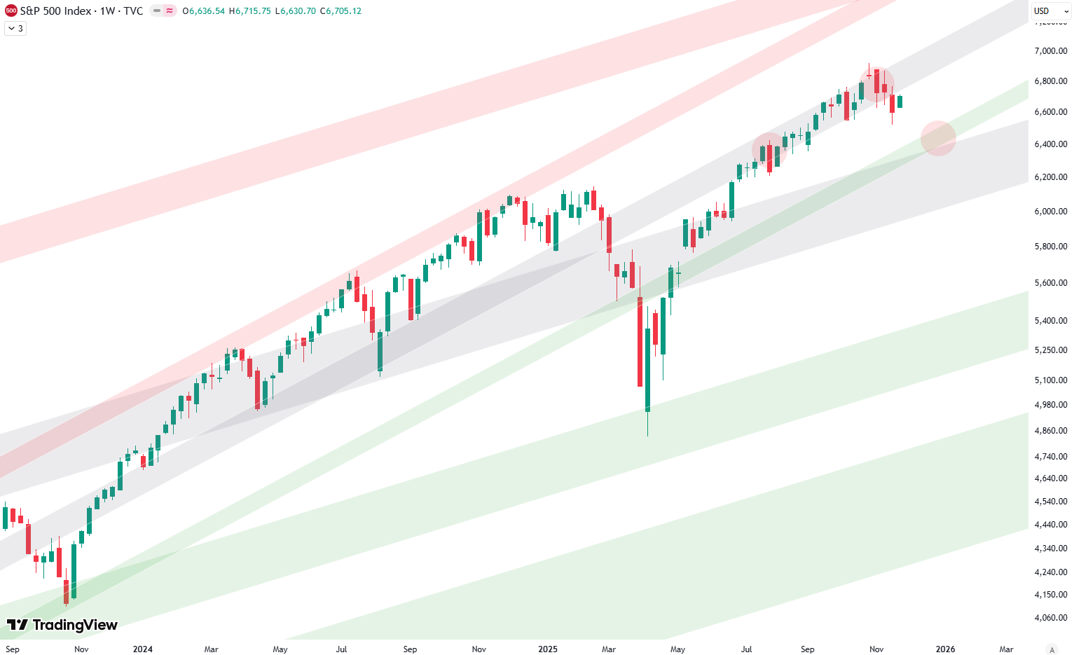
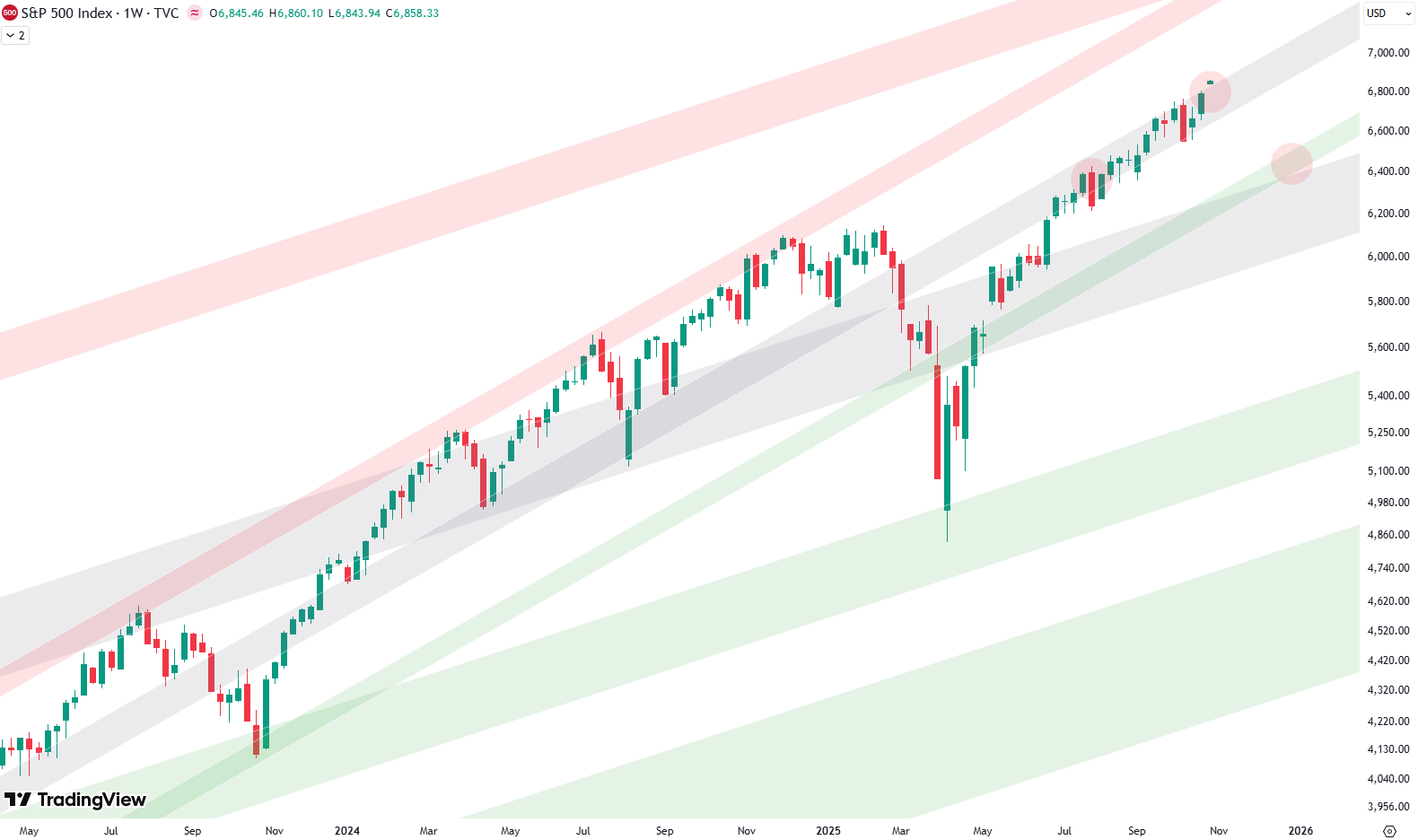
S&P 500: The Big Picture
Hello and welcome to our big picture analysis of the S&P 500. We’re starting here by looking at the monthly and weekly candle charts. We begin with the long-term trend from 2008 to today. We’re in a very clean rising trend channel, which gives us a good sense of the overall structure. To better understand…
-

Top ETFs Near Support: What to Watch and Where to Trim
Welcome to our ETF update. We provide an overview of different ETFs across various asset classes and base our analysis on technicals. We list some ETFs that, from a risk/reward perspective, currently look like good buy opportunities, and others that are better suited as sell or take-profit options right now. Want to know the best…
-

Analyzing 100 Years of the S&P 500: A Technical Perspective
When it comes to understanding the S&P 500 on a long-term scale, there’s nothing quite like zooming out. By looking at a yearly chart, where each candle represents one year of market movement, we gain valuable perspective. Spanning more than 100 years, this approach offers clarity about where we stand today while letting us analyze…
-
Top ETFs Near Support: What to Watch and Where to Trim
Welcome to our ETF update. We provide an overview of different ETFs across various asset classes and base our analysis on technicals. We list some ETFs that, from a risk/reward perspective, currently look like good buy opportunities, and others that are better suited as sell or take-profit options right now. Want to know the best…
-
S&P 500: The Big Picture
Hello and welcome to our big picture analysis of the S&P 500. We’re starting here by looking at the monthly and weekly candle charts. We begin with the long-term trend from 2008 to today. We’re in a very clean rising trend channel, which gives us a good sense of the overall structure. To better understand…
-
Top ETFs Near Support: What to Watch and Where to Trim
Welcome to our ETF update. We provide an overview of different ETFs across various asset classes and base our analysis on technicals. We list some ETFs that, from a risk/reward perspective, currently look like good buy opportunities, and others that are better suited as sell or take-profit options right now. Want to know the best…
-
Analyzing 100 Years of the S&P 500: A Technical Perspective
When it comes to understanding the S&P 500 on a long-term scale, there’s nothing quite like zooming out. By looking at a yearly chart, where each candle represents one year of market movement, we gain valuable perspective. Spanning more than 100 years, this approach offers clarity about where we stand today while letting us analyze…
-
Top ETFs Near Support: What to Watch and Where to Trim
Welcome to our ETF update. We provide an overview of different ETFs across various asset classes and base our analysis on technicals. We list some ETFs that, from a risk/reward perspective, currently look like good buy opportunities, and others that are better suited as sell or take-profit options right now. Want to know the best…
-
S&P 500: The Big Picture
Hello and welcome to our big picture analysis of the S&P 500. We’re starting here by looking at the monthly and weekly candle charts. We begin with the long-term trend from 2008 to today. We’re in a very clean rising trend channel, which gives us a good sense of the overall structure. To better understand…
-
Top ETFs Near Support: What to Watch and Where to Trim
Welcome to our ETF update. We provide an overview of different ETFs across various asset classes and base our analysis on technicals. We list some ETFs that, from a risk/reward perspective, currently look like good buy opportunities, and others that are better suited as sell or take-profit options right now. Want to know the best…