Tag: #Bullish
-
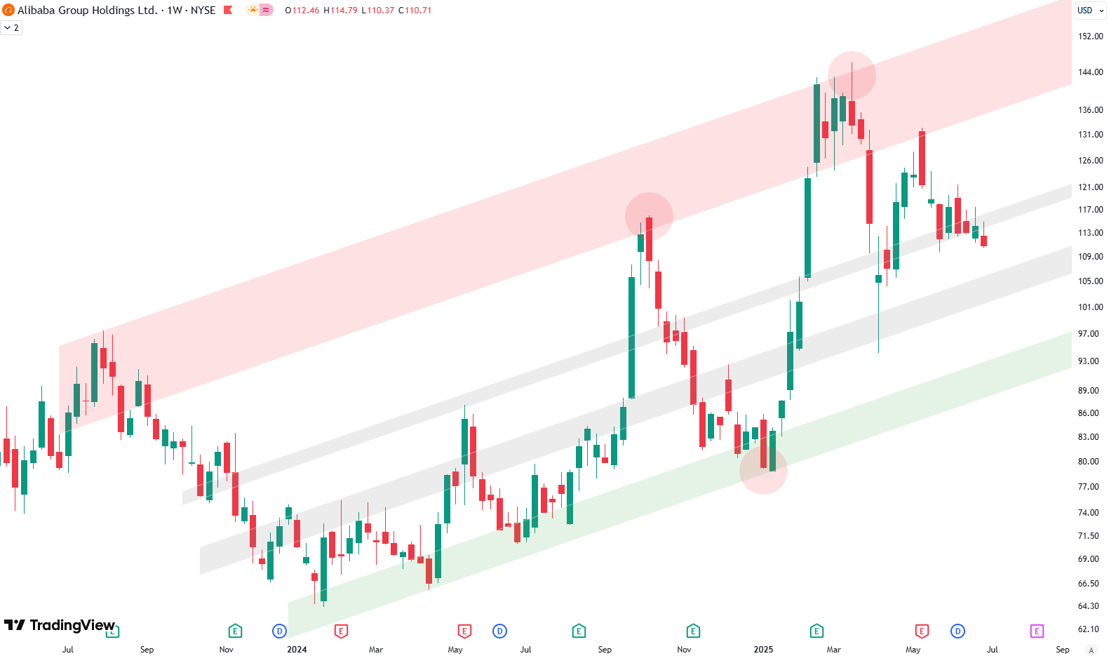
Alibaba Technical Analysis: Consolidation or Breakdown?
channel, where the green shaded area represents a support zone at the bottom, the red zone represents a resistance zone at the top of the channel, and the grey shaded areas lie in the middle, serving as both support and resistance — more like balance points. Looking at the chart, which goes back to July…
-

How We Use Weekly Moving Averages to Guide ETF Entries
Welcome to our ETF update. We provide an overview of different ETFs across various asset classes and base our analysis on technicals. We list some ETFs that, from a risk/reward perspective, currently look like good buy opportunities, and others that are better suited as sell or take-profit options right now. Want to know the best…
-
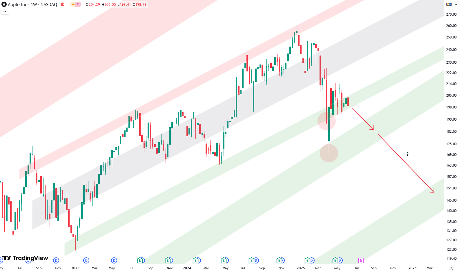
Apple Lags Behind S&P 500: Warning Signs on the Chart
Hello everybody, this week we’ll take a look at Apple. We’re looking at the monthly chart, which goes quite a way back — all the way to the year 1999 — so we’ve got a solid 25 years of price data here. We can draw a very nice and clean upward trend channel, using green,…
-

Analyzing 100 Years of the S&P 500: A Technical Perspective
When it comes to understanding the S&P 500 on a long-term scale, there’s nothing quite like zooming out. By looking at a yearly chart, where each candle represents one year of market movement, we gain valuable perspective. Spanning more than 100 years, this approach offers clarity about where we stand today while letting us analyze…
-

S&P 500 Monthly Chart Turns Bearish
Hello everybody. This week, we’ll take a look at the long-term picture on the S&P 500, starting with the monthly chart, which goes back to 2020. We’re focusing on this because a major technical indicator has recently been triggered—the monthly MACD. A Sell Signal from the Monthly MACD The MACD, or Moving Average Convergence Divergence,…
-

Is Microsoft Due for a Pullback? The Charts Suggest So
This week, we’re revisiting Microsoft with a fresh look at both the weekly and daily charts. For context, we first published this chart setup back in March. It’s the same long-term view that stretches all the way back to 2020—nothing changed structurally, just updated with current price action. This trend structure dates back to 2020.…
-

GDX Breaks Out: Why Gold Miners Might Be Gearing Up for a Bigger Move
This week, I’ve been watching GDX — the VanEck Gold Miners ETF — and it’s looking pretty interesting. GDX is a popular way to get exposure to gold mining stocks, which tend to react more strongly to changes in gold prices than the metal itself. Why? It comes down to operational leverage. Gold miners have…
-

Alphabet’s Technical Breakdown: Signals for the S&P 500?
If you’ve been tracking Alphabet (GOOG) like I have, you might be noticing something interesting — and maybe a little concerning. So, let’s break this down together, especially if you’re newer to investing. We’ll go from the big picture down to the day-to-day action. I’ll also show you what’s going on in the charts (you’ll…
-

DXY Technical Analysis: Watching the 100 Line and Trend Support
If you’ve ever wondered how strong the U.S. dollar is compared to other major currencies, you’ve probably heard about the U.S. Dollar Index — also known as the DXY. Right now, it’s sitting at a critical spot on the charts, and whether you’re new to investing or just curious, it’s worth paying attention. What is…
-
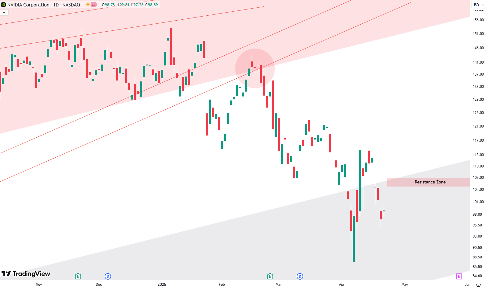
NVIDIA Stock Analysis: Why This Could Be a Key Turning Point
Let’s check in on NVIDIA this week. Starting off with the weekly chart (we’re looking back to 2021 here), there’s a clear upward trend channel made up of green, gray, and red shaded zones. These aren’t just colors — they’ve played real roles over time. The green zone has acted as support, the red one…