Tag: #Bonds
-
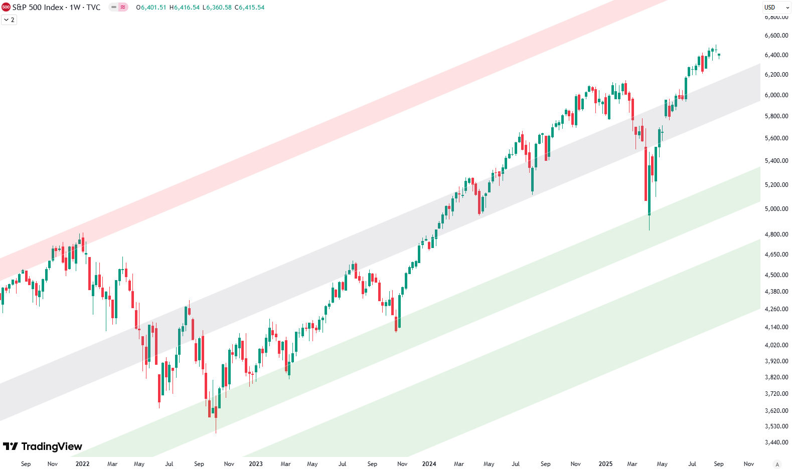
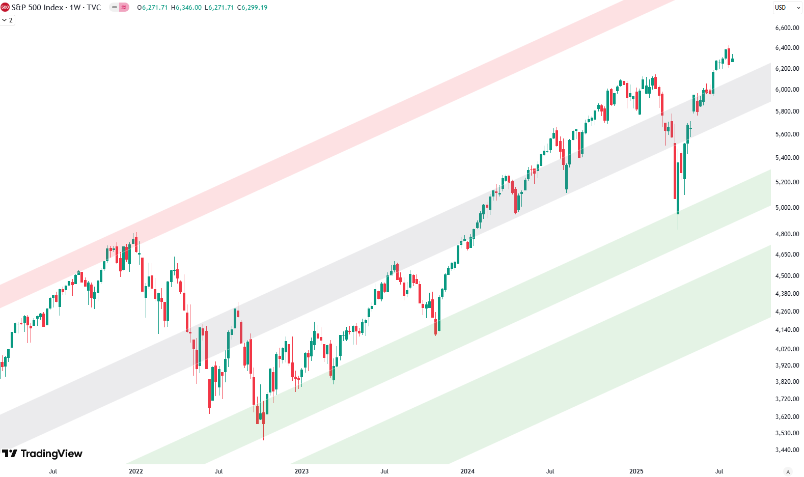
S&P 500: The Big Picture
Hello and welcome to our big picture analysis of the S&P 500. We’re starting here by looking at the monthly and weekly candle charts. We begin with the long-term trend from 2008 to today. We’re in a very clean rising trend channel, which gives us a good sense of the overall structure. To better understand…
-

Analyzing 100 Years of the S&P 500: A Technical Perspective
When it comes to understanding the S&P 500 on a long-term scale, there’s nothing quite like zooming out. By looking at a yearly chart, where each candle represents one year of market movement, we gain valuable perspective. Spanning more than 100 years, this approach offers clarity about where we stand today while letting us analyze…
-
S&P 500: The Big Picture
Hello and welcome to our big picture analysis of the S&P 500. We’re starting here by looking at the monthly and weekly candle charts. We begin with the long-term trend from 2008 to today. We’re in a very clean rising trend channel, which gives us a good sense of the overall structure. To better understand…
-
Analyzing 100 Years of the S&P 500: A Technical Perspective
When it comes to understanding the S&P 500 on a long-term scale, there’s nothing quite like zooming out. By looking at a yearly chart, where each candle represents one year of market movement, we gain valuable perspective. Spanning more than 100 years, this approach offers clarity about where we stand today while letting us analyze…
-
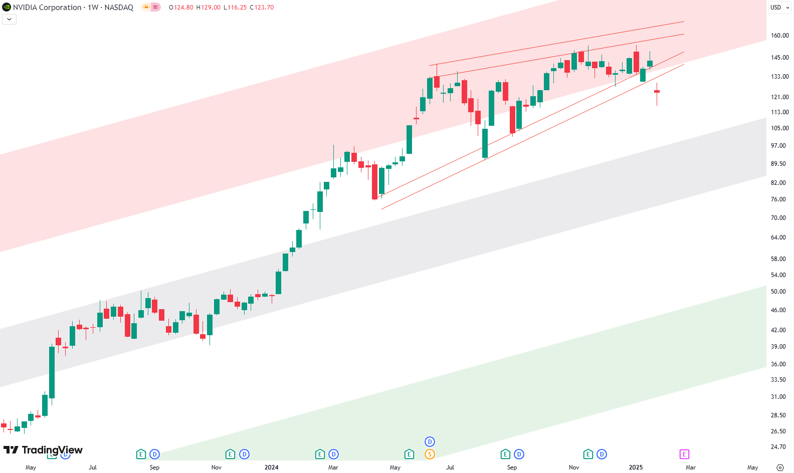
Bearish Patterns Take Over NVIDIA’s Chart
This week, NVIDIA is making headlines, and not just because of its impressive run in the stock market. A shock from China has raised some big questions about the company’s future. A new AI model, DeepSeek, has entered the scene and is reportedly delivering results comparable to other AI, but at a much lower cost.…
-

Is This the Healthcare Sector’s Next Bullish Move?
Understanding XLV’s Long-Term Picture When it comes to analyzing the Healthcare sector in the S&P 500, XLV is in the spotlight. Let’s start with the long-term chart—each candle here represents one month, spanning all the way from 2008 to today. What makes this chart fascinating is the clear, upward-rising trend channel, marked by green support…
-

Technical Breakdown of GDX: Testing Resistance Levels
The gold miner ETF (GDX) has been moving within a well-established trend channel since 2015. Let’s break down the charts to understand where it might head next. Monthly Chart: The Big Picture Since 2015 Looking at GDX’s monthly chart, we see a steady upward trend channel framed by a green area at the bottom (support),…
-

T-Mobile: A 15-Year Trendline Analysis
This week, we’re diving into T-Mobile’s stock with an interesting chart that dates back to 2009. This chart uses a logarithmic scale, showcasing a clear and steady trend channel defined by three parallel trendlines: the green line at the bottom, the grey line in the middle, and the red line at the top. Each line…
-

Meta’s Weekly Chart Analysis
Since hitting a low in October 2022, Meta’s stock has seen an extraordinary rise of 500%, outpacing many of its peers in the tech sector. This dramatic rebound underscores Meta’s resilience as the company continues to recover from challenges it faced in the preceding years. Examining the weekly chart, we observe three key parallel trendlines—green,…